Contact Us
Careers
FAQ

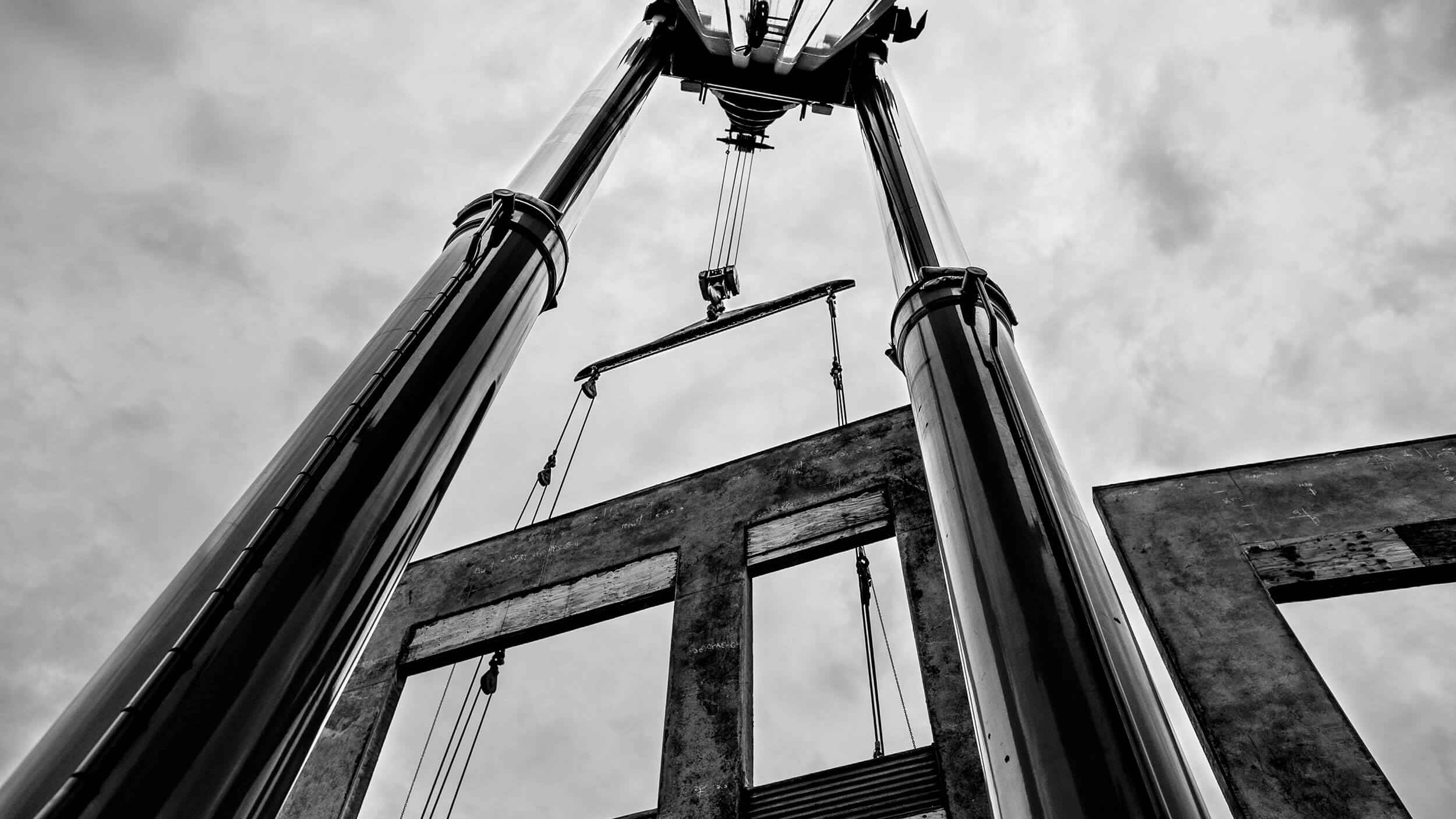
Ness and Campbell had each built strong reputations in the Pacific Northwest, specializing in complex lifts, large transports, and engineered rigging solutions. Both companies were trusted by contractors for their technical expertise and ability to tackle difficult jobs. When the two companies merged, it wasn’t just about logistics and operations—it was about creating a unified brand that employees could rally around and that would signal a new era in the industry.
With five new owners leading the transition, this was a defining moment to reimagine what NessCampbell could become. The goal was to establish a brand that did more than represent cranes—it had to embody a culture of strength, precision, and teamwork. The company’s success would be built not only on its fleet and capabilities but also on a thriving employee culture where being part of NessCampbell meant something more. Watson was brought in to shape that identity from the ground up.

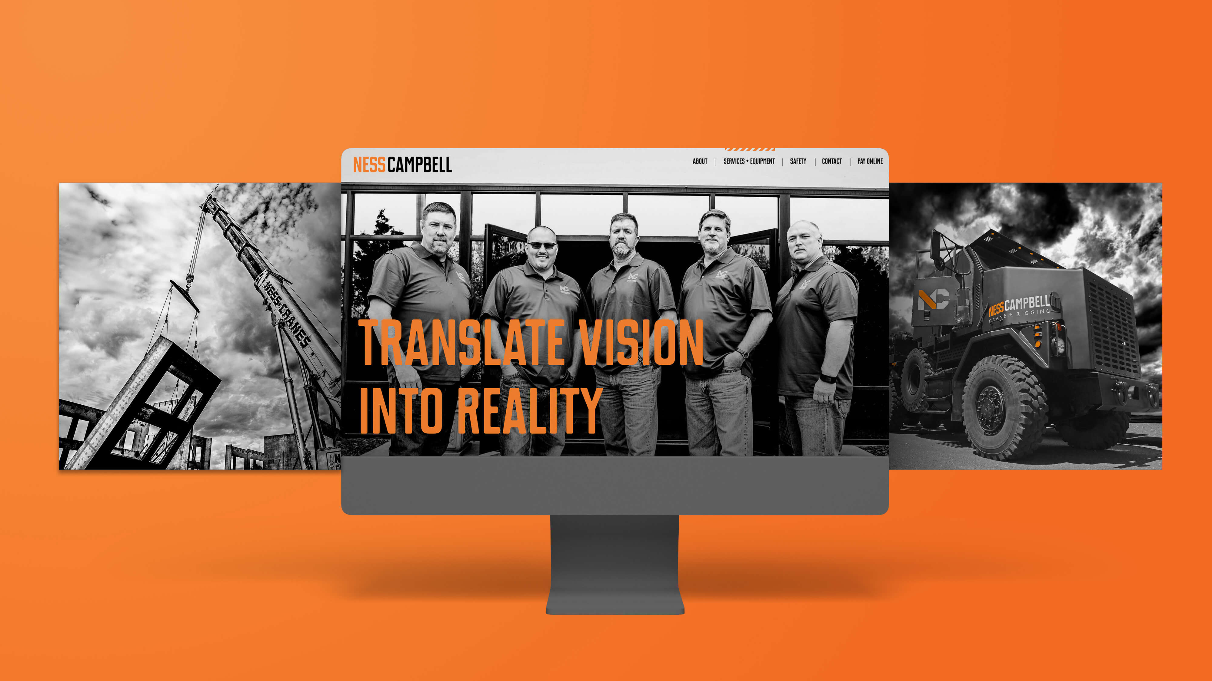

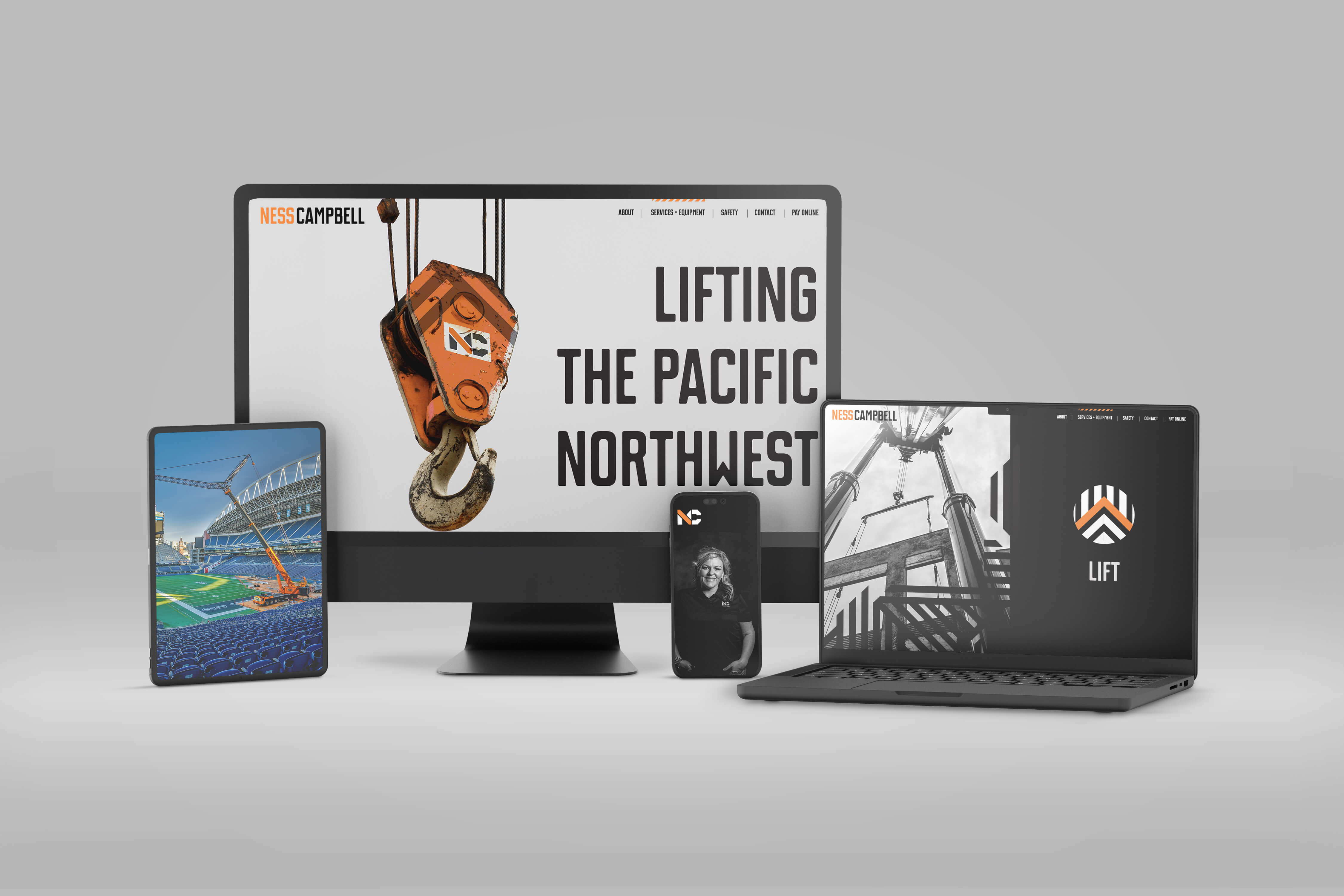
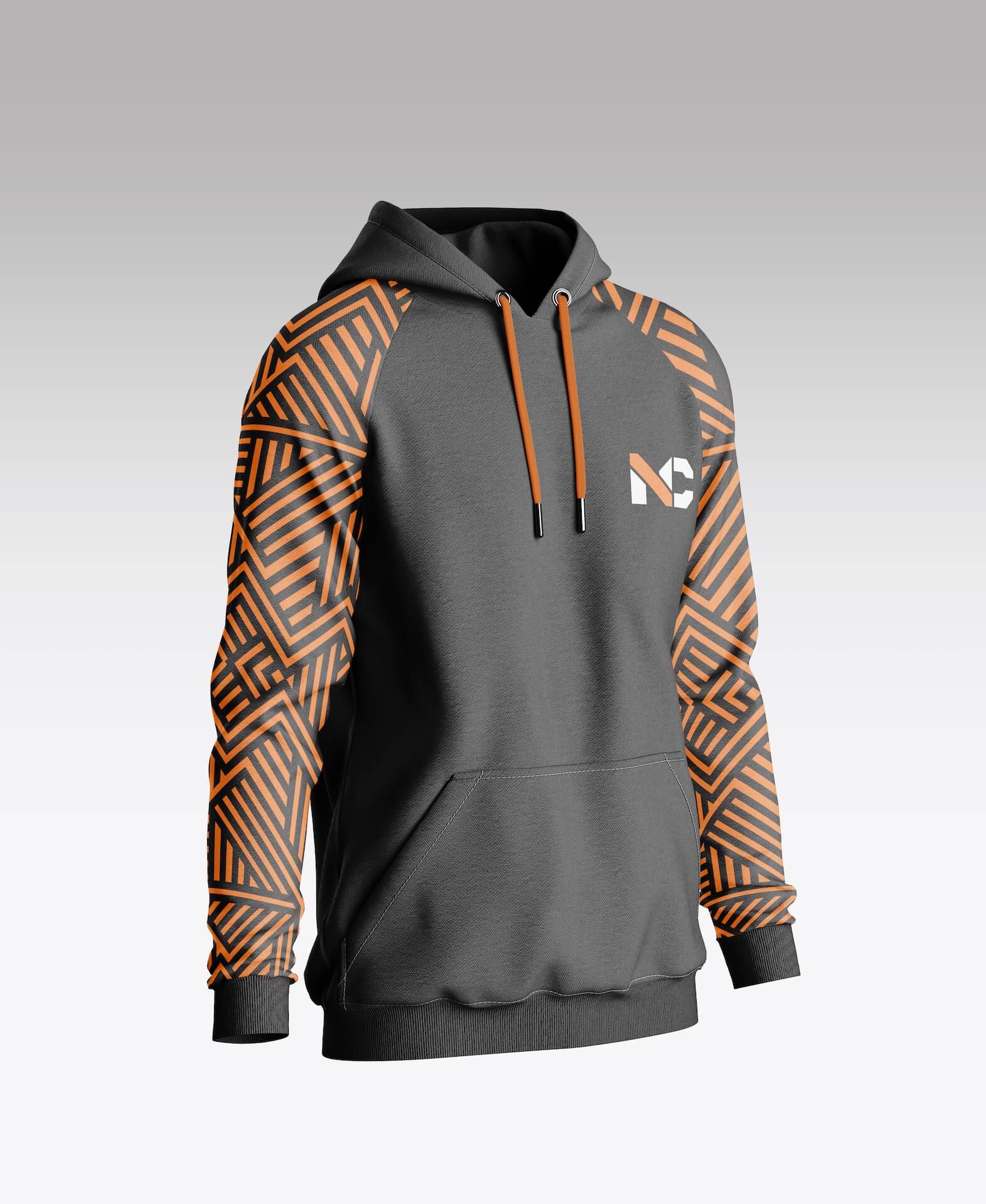
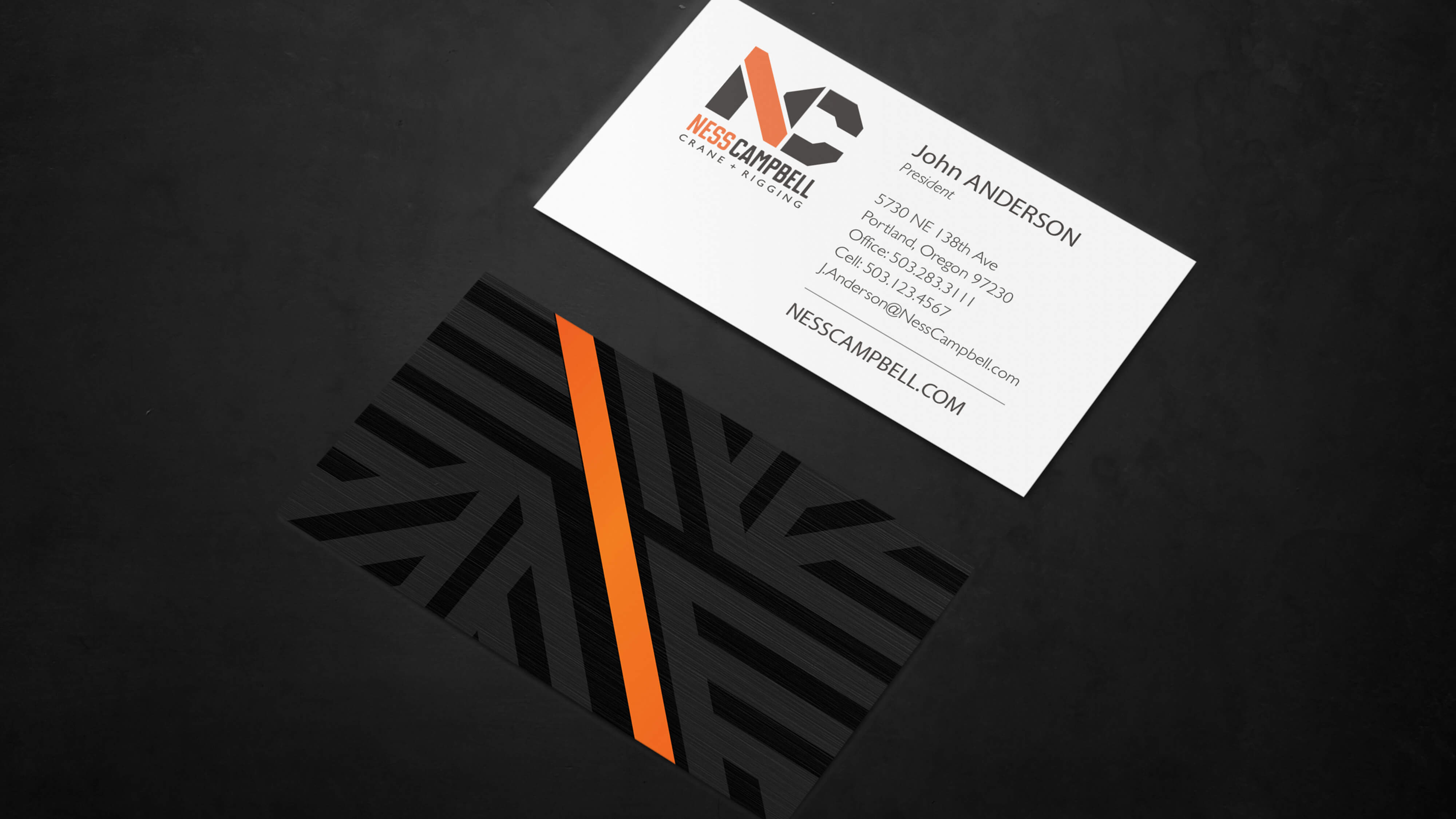
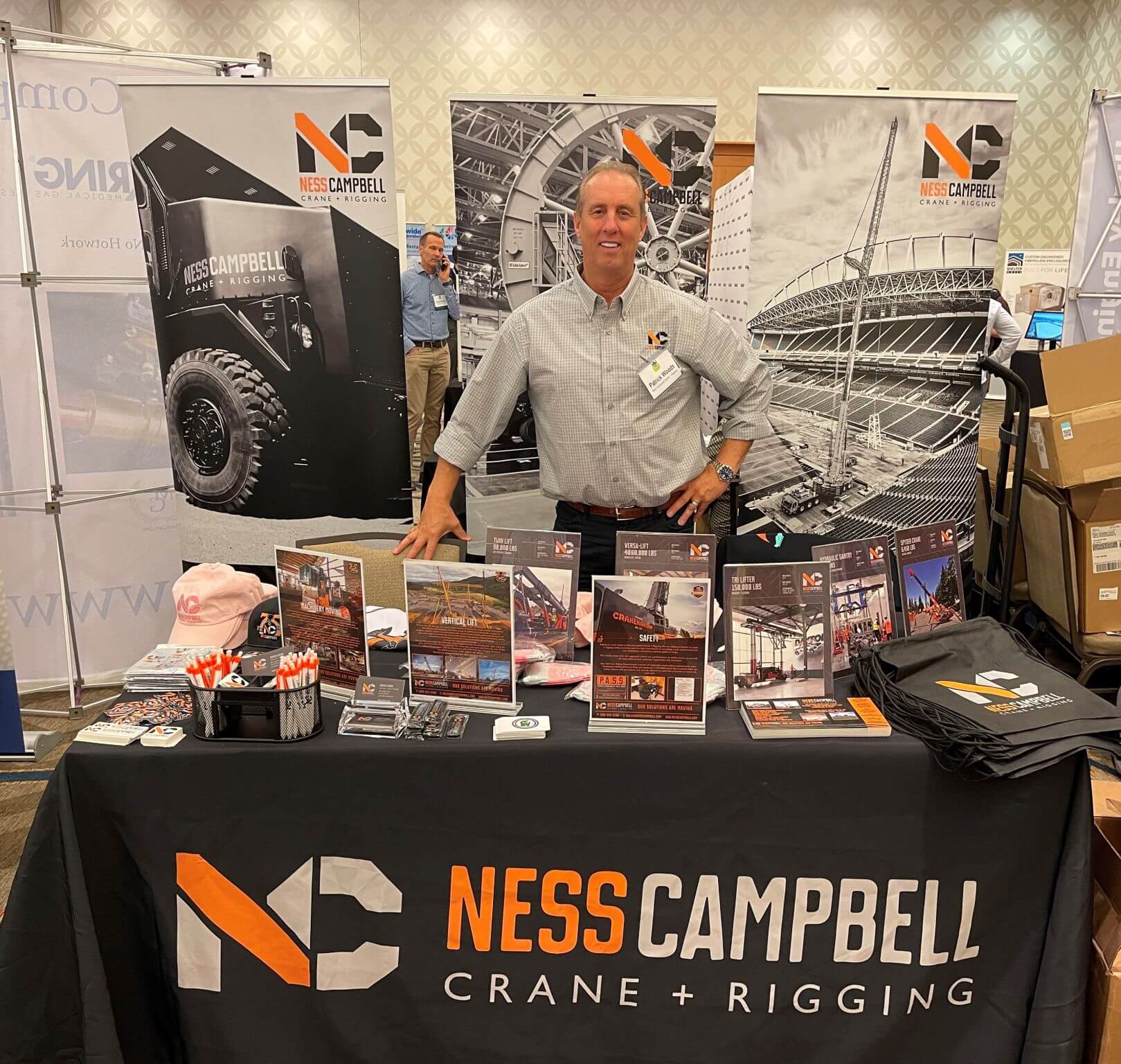
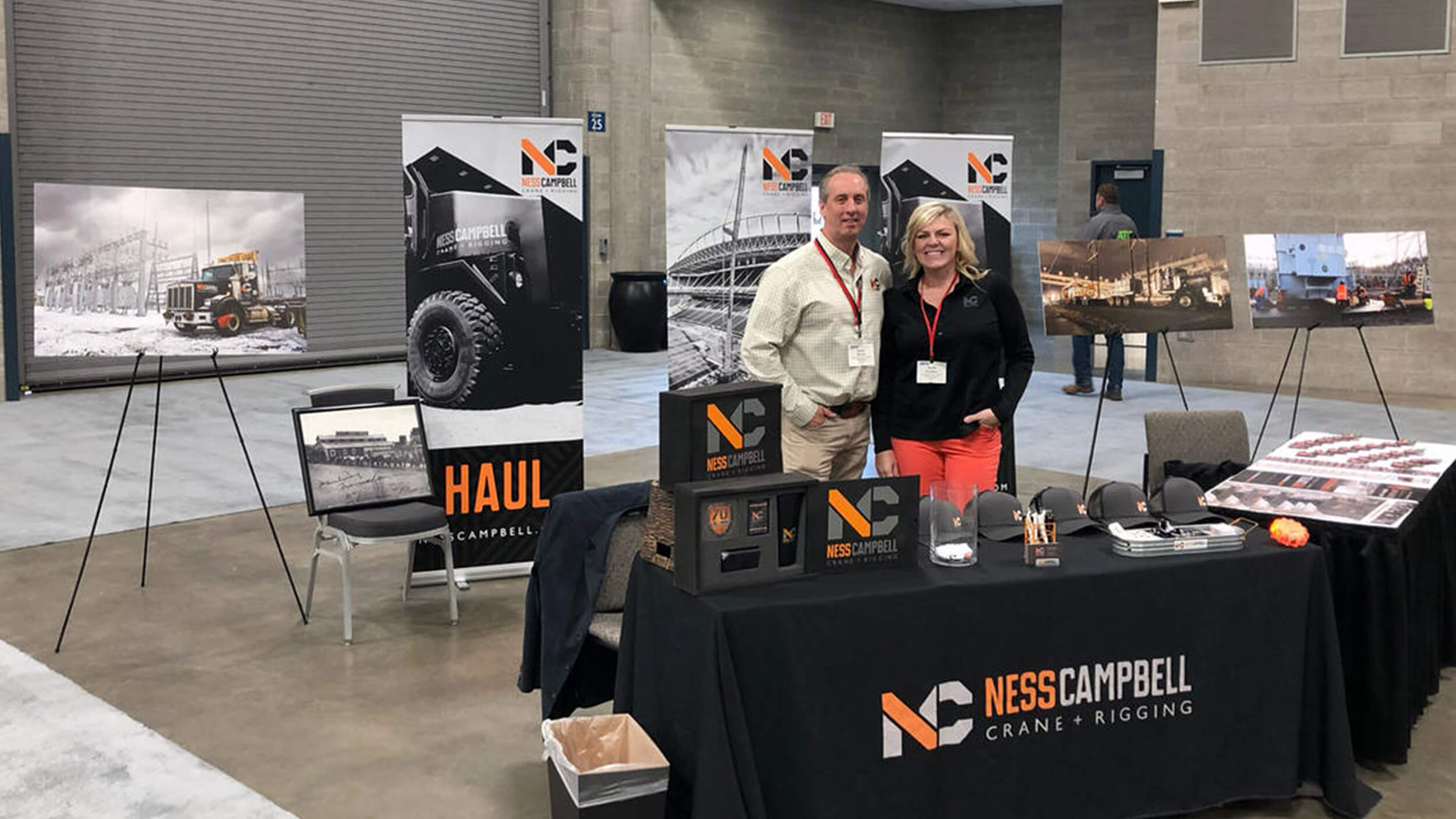
The branding challenge was to create a mark that was instantly recognizable, timeless, and something employees would wear with pride. The new NessCampbell brand wasn’t just about merging two names—it was about creating a badge of honor for the people who made the company what it was.
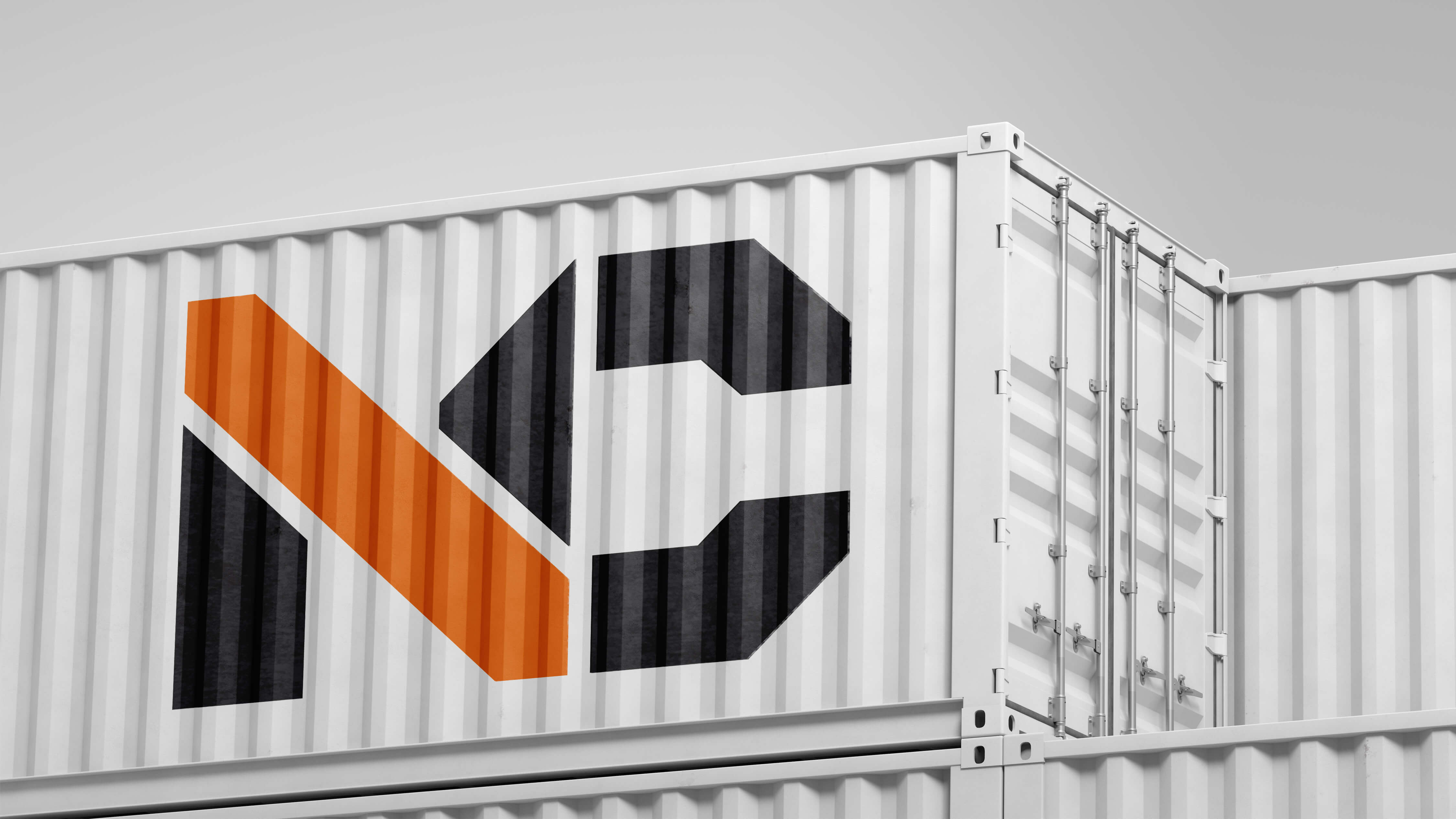
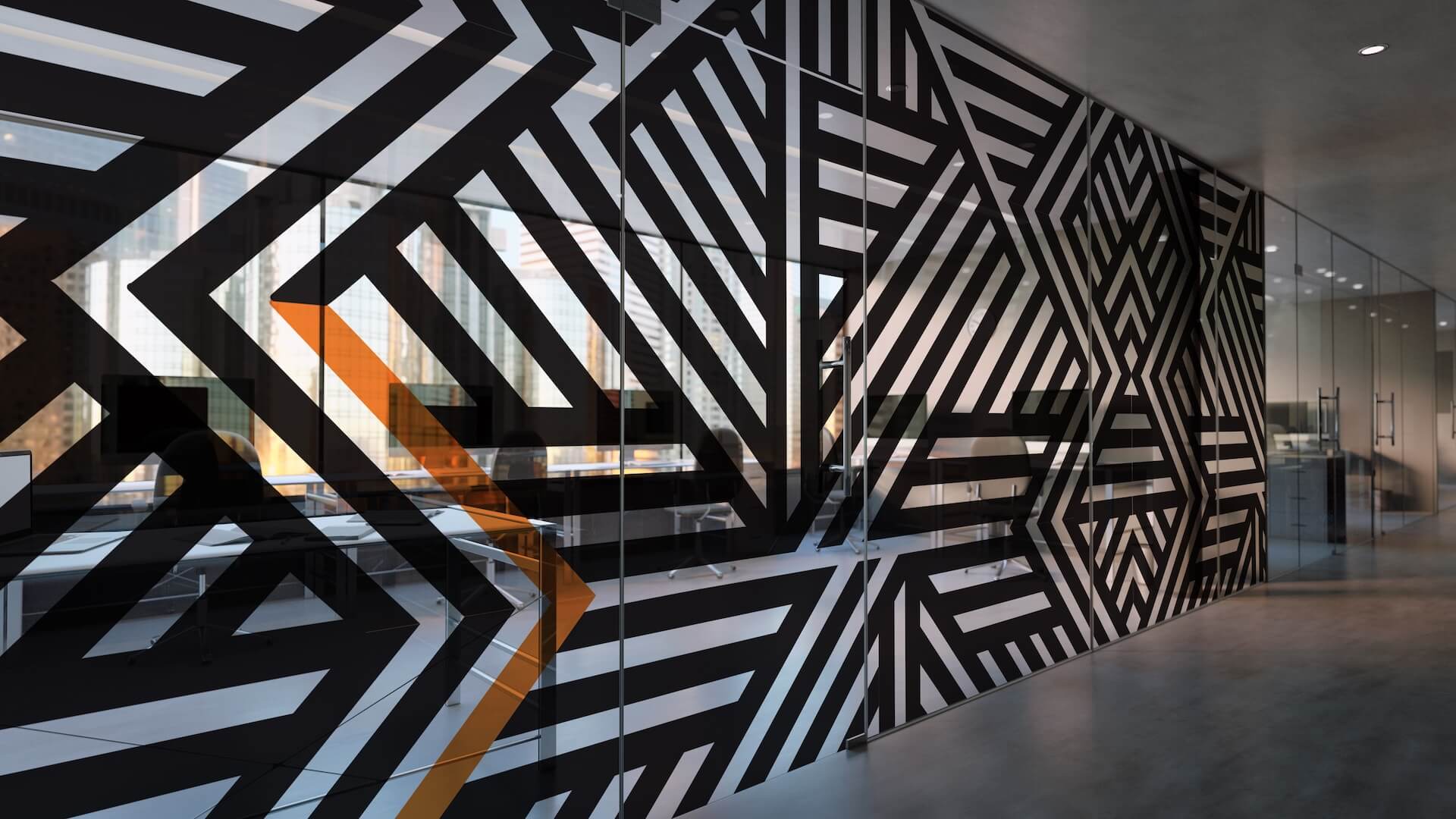
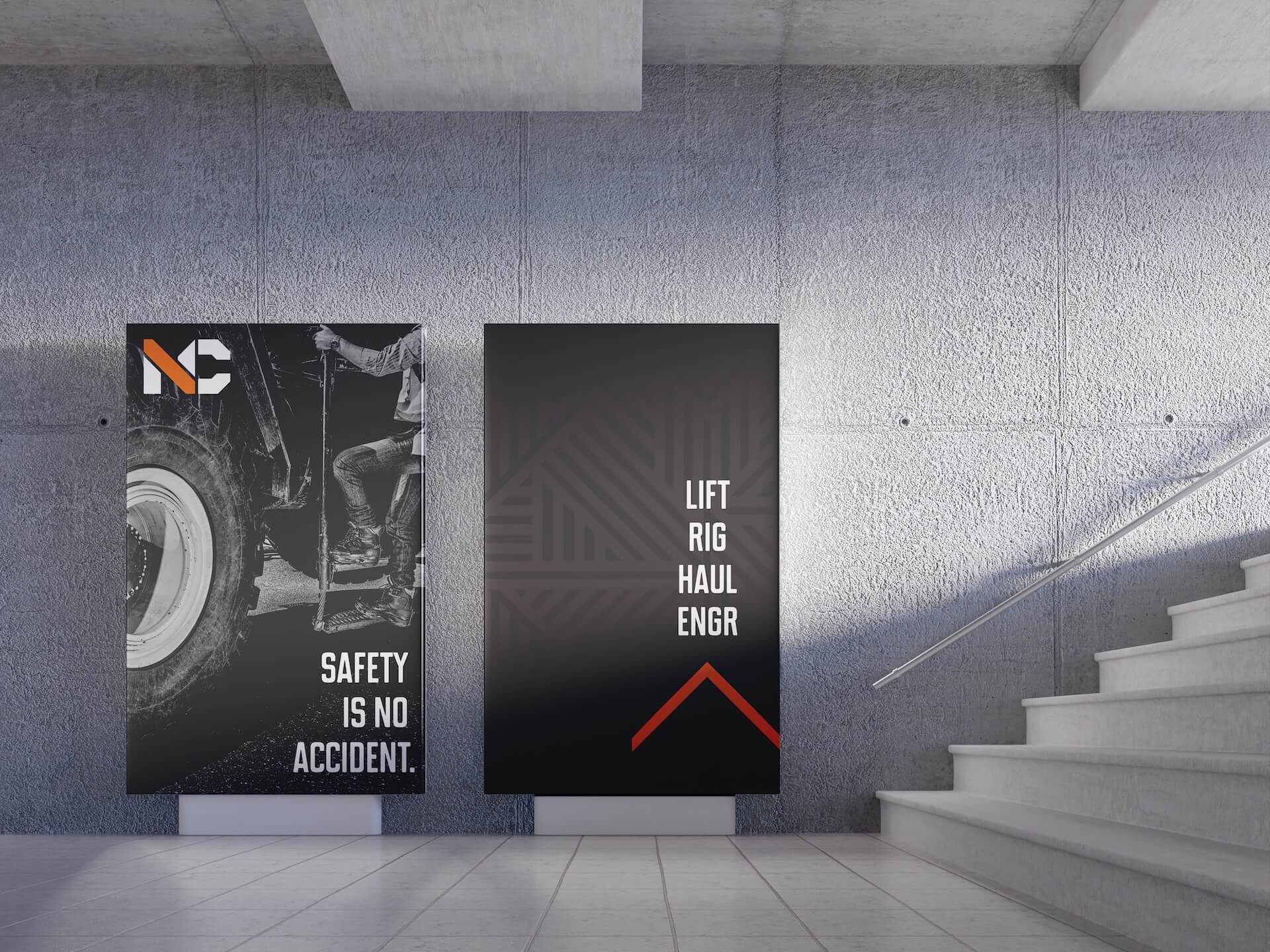
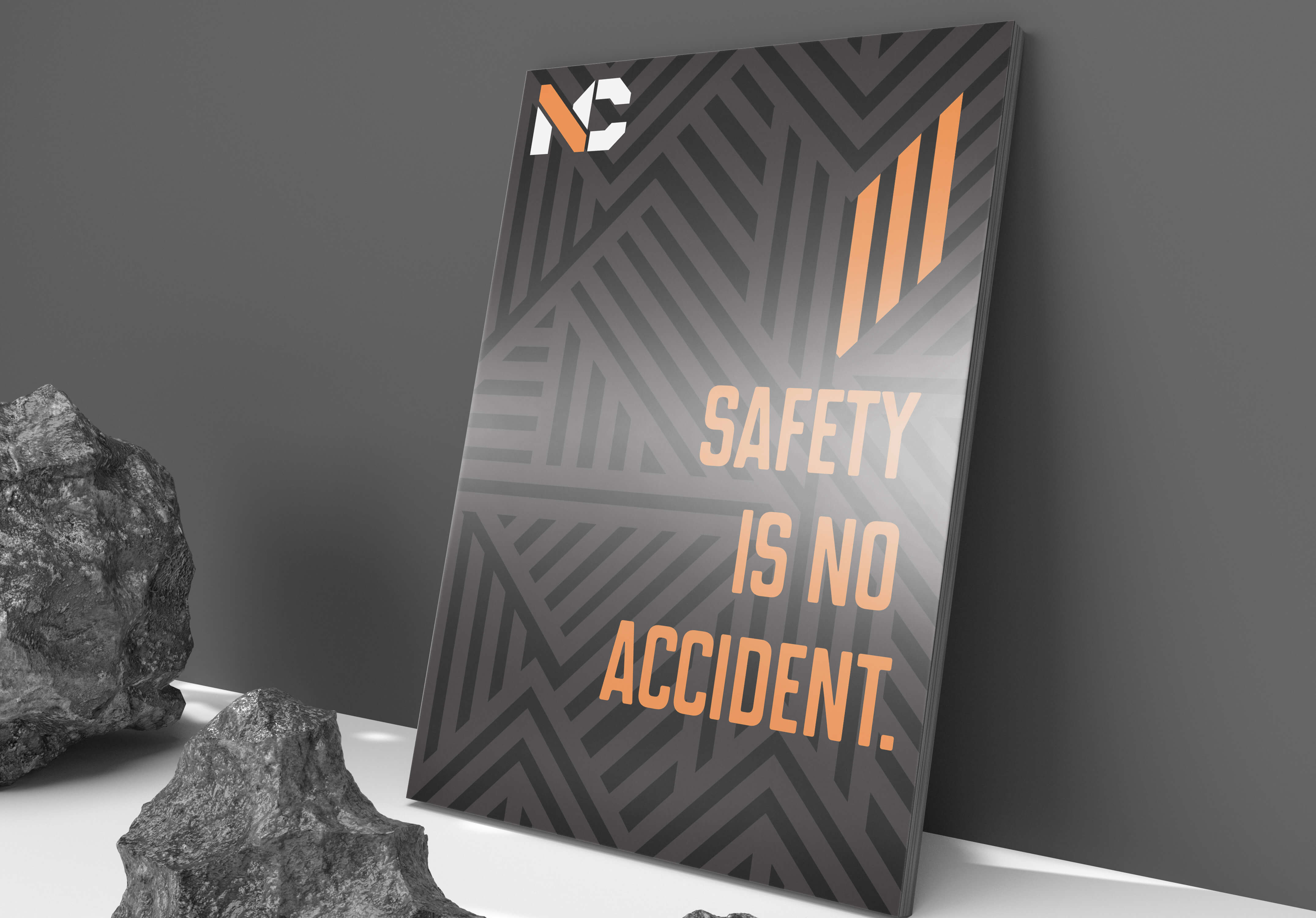
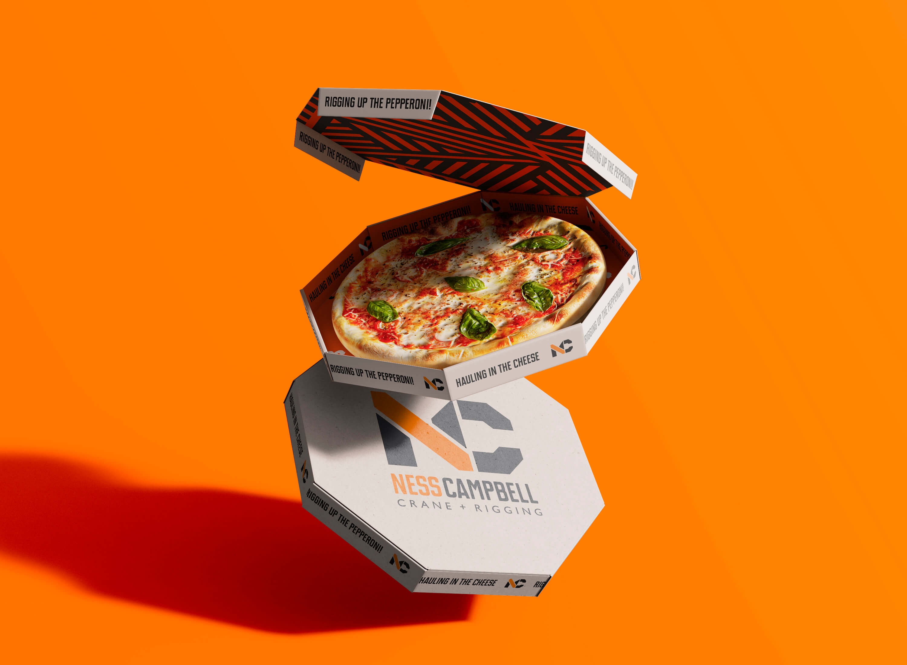
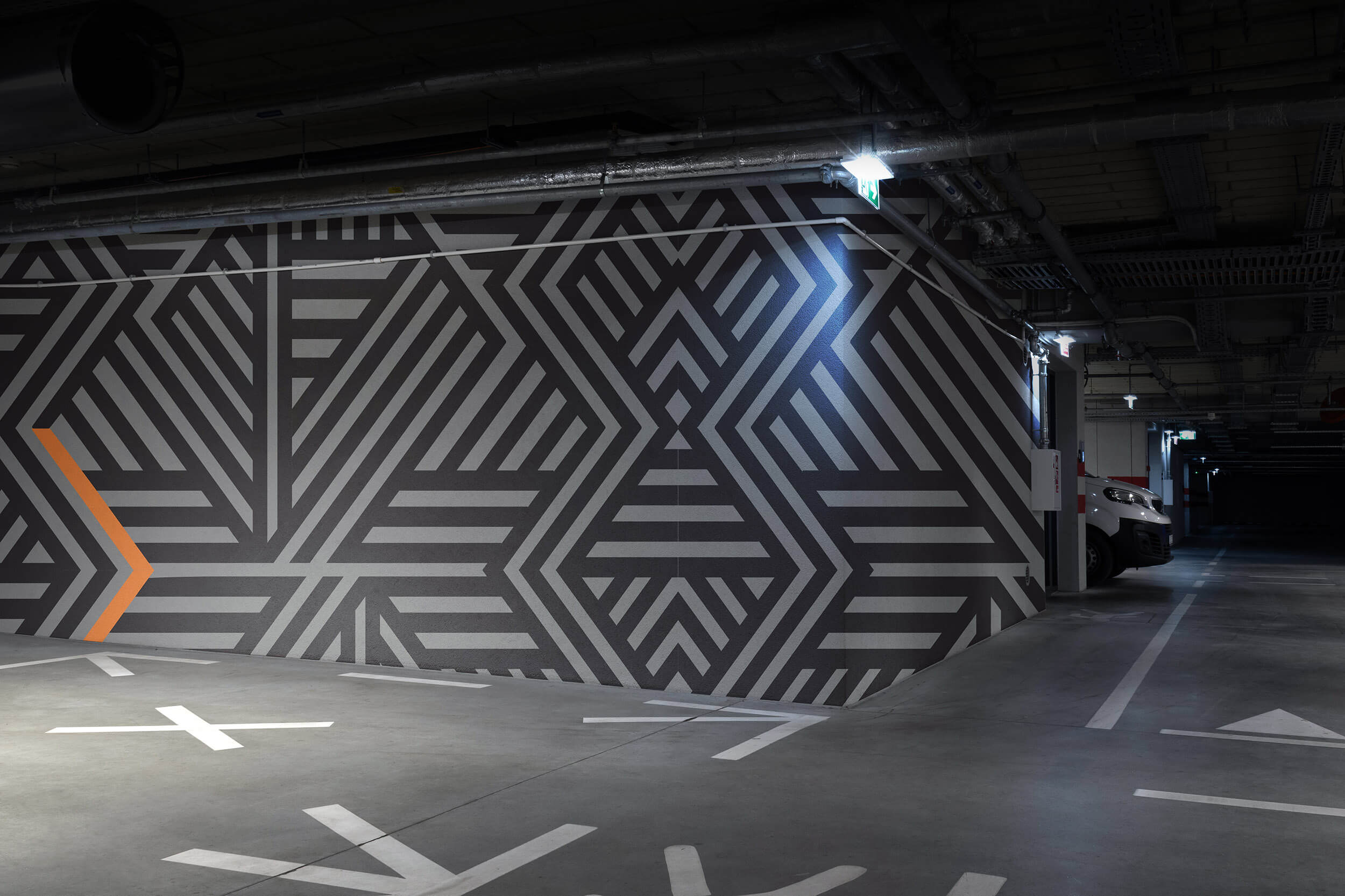
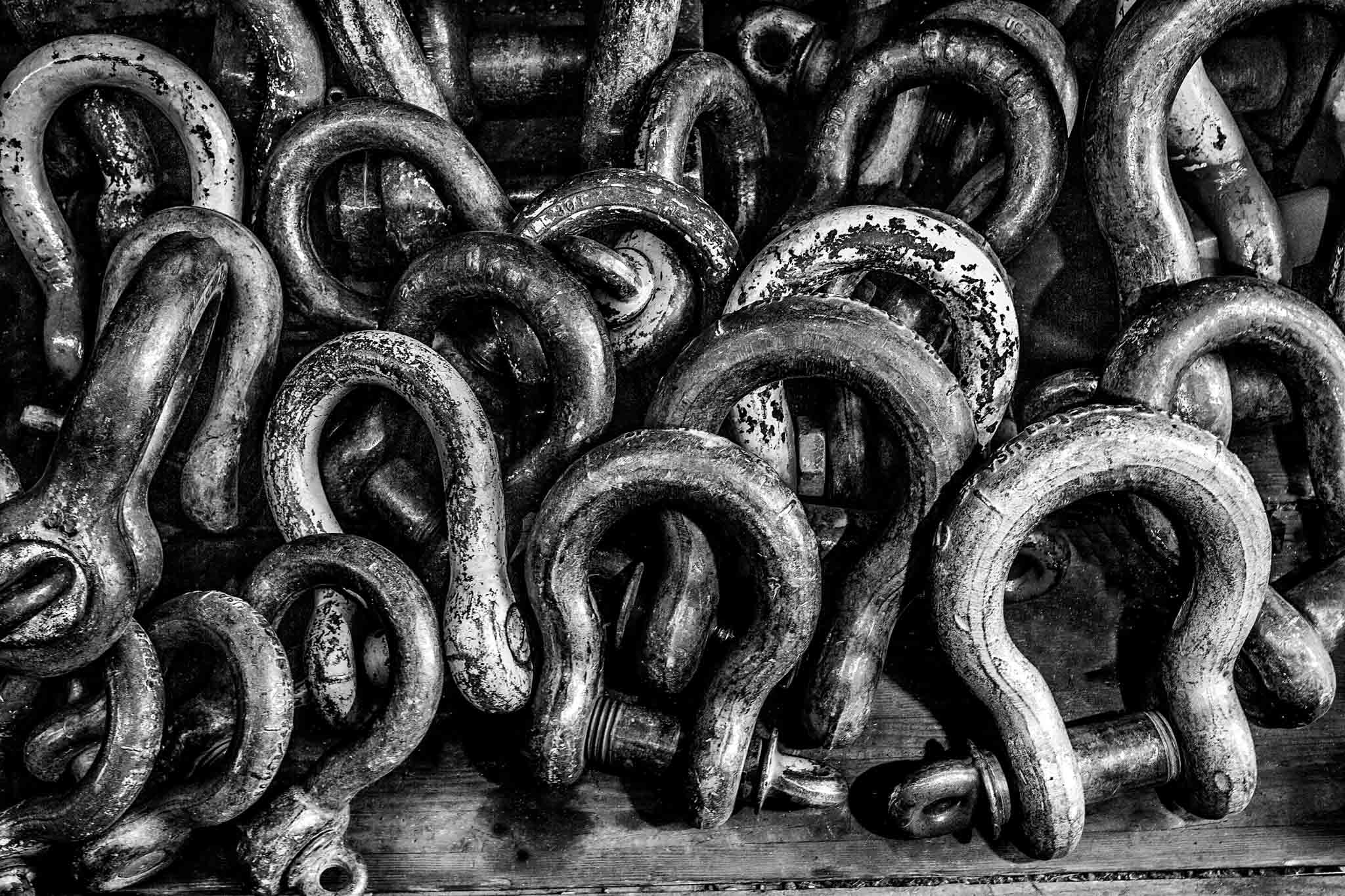
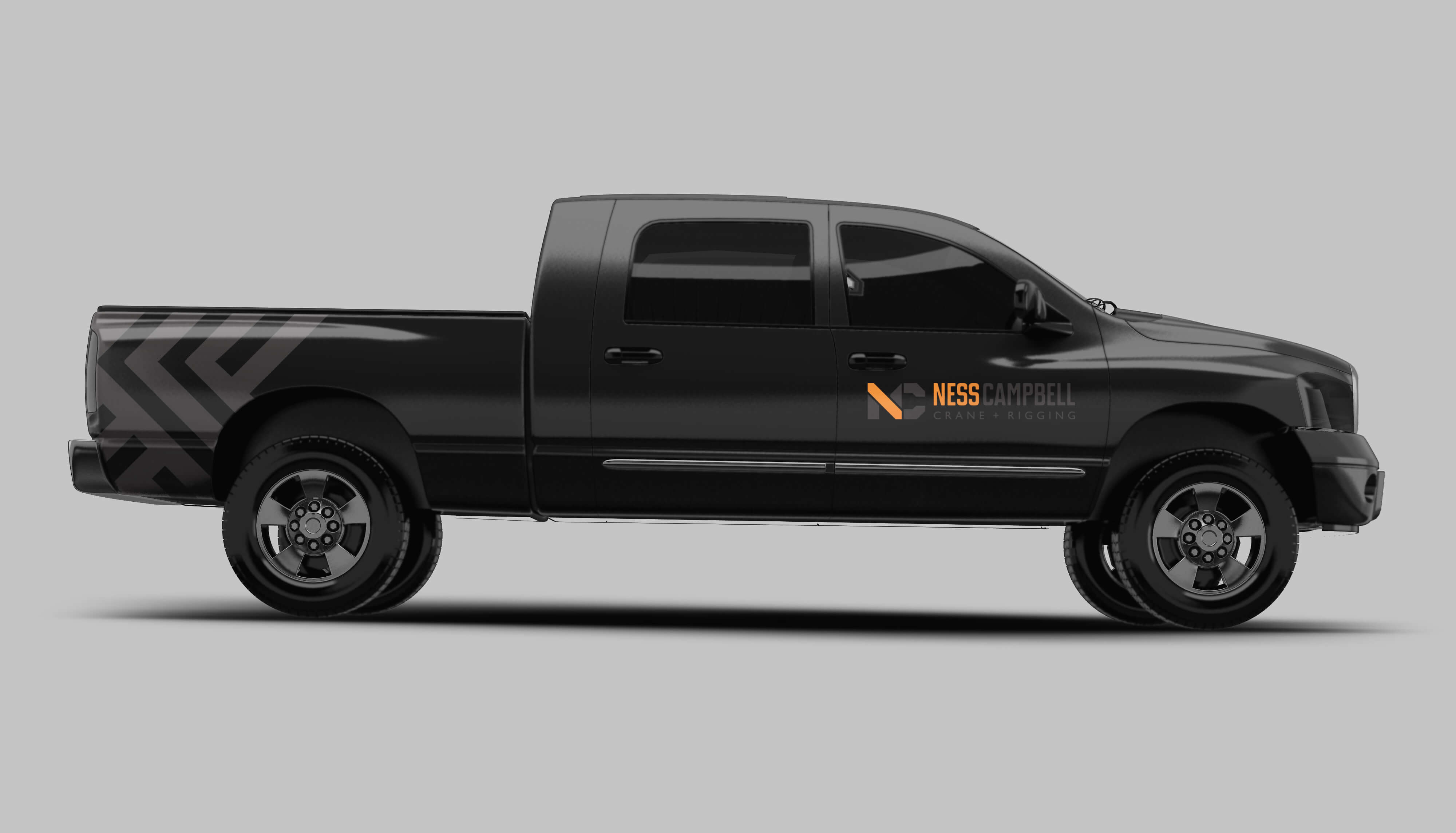
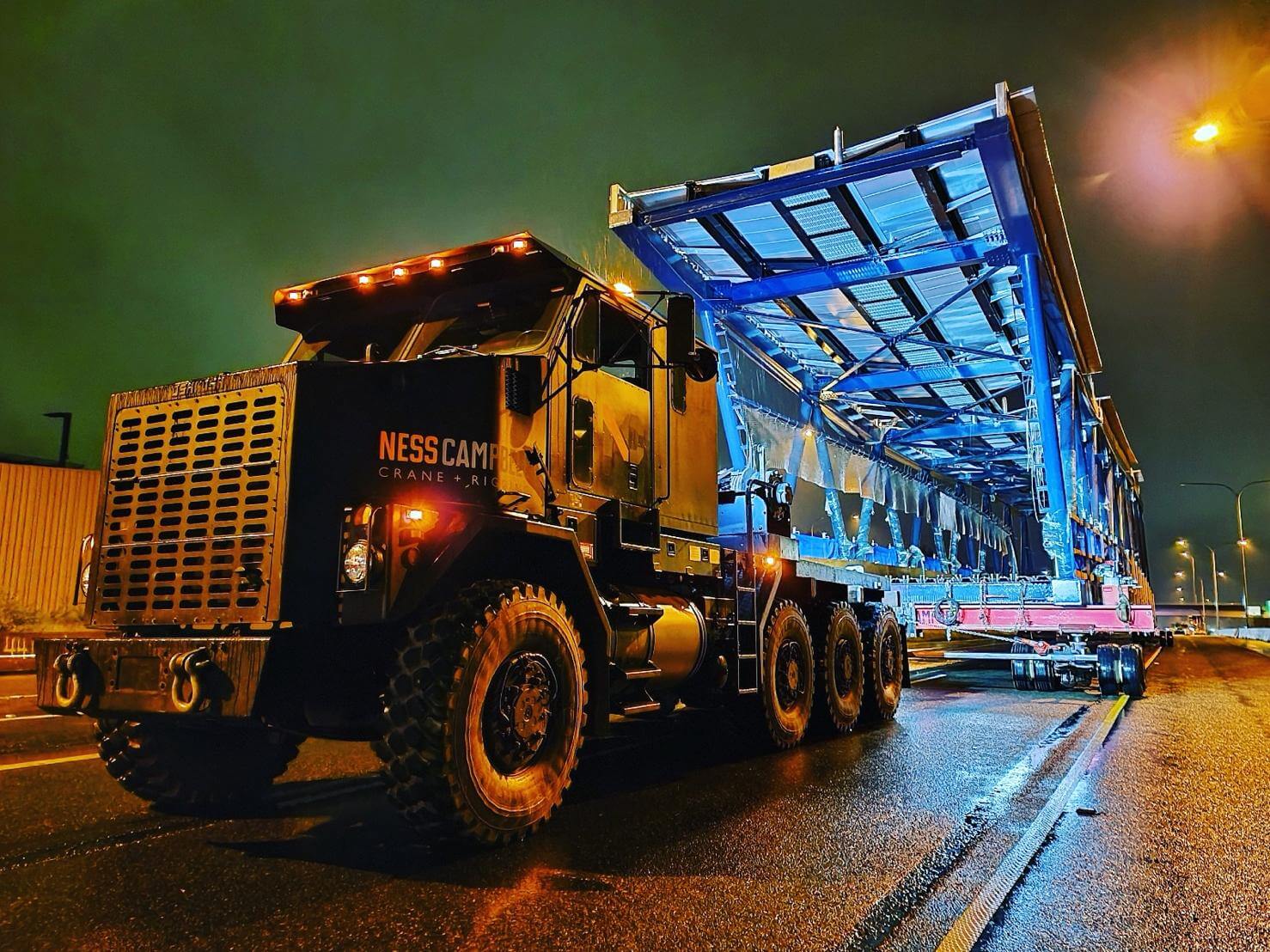
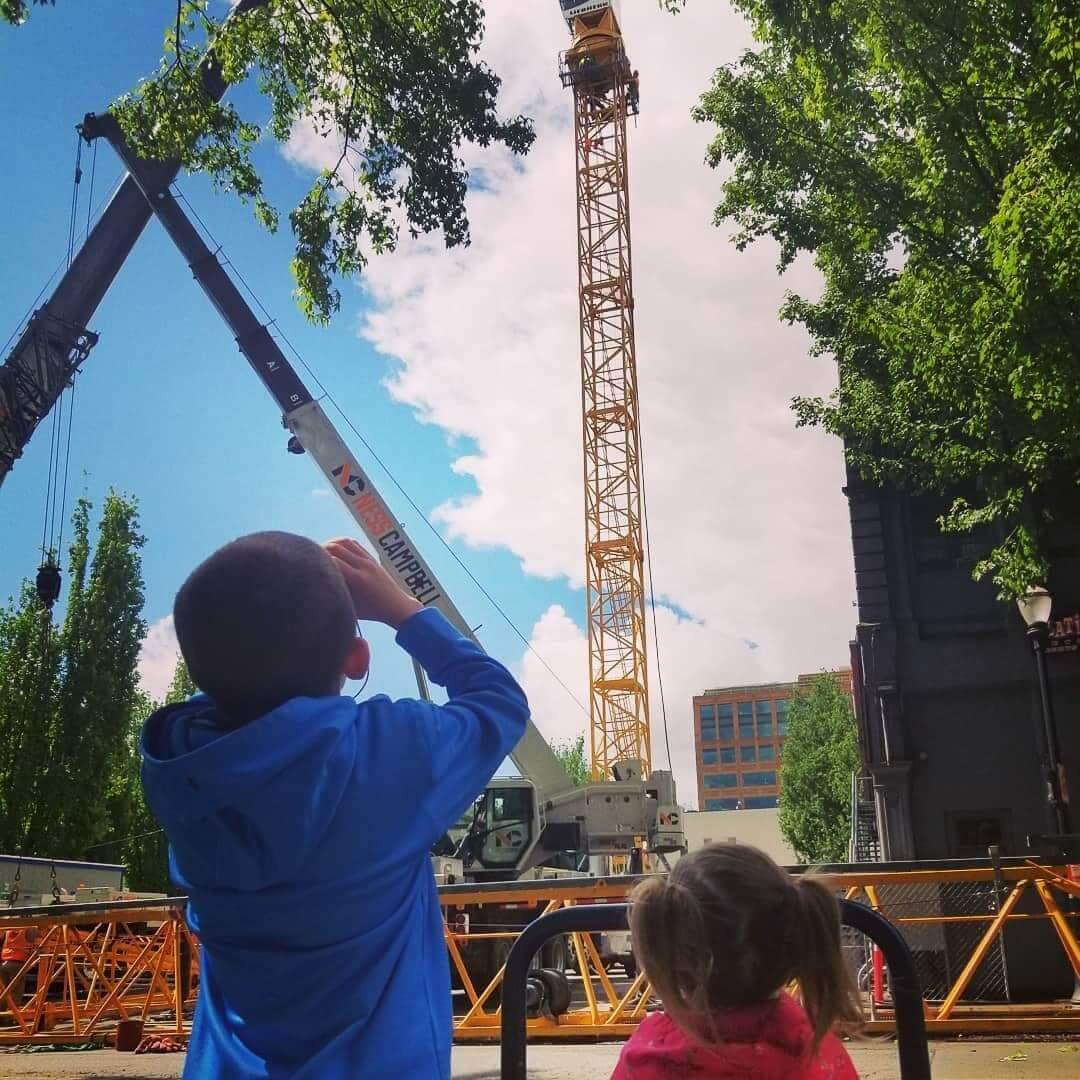
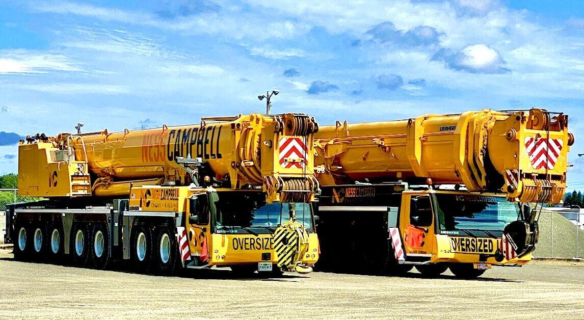
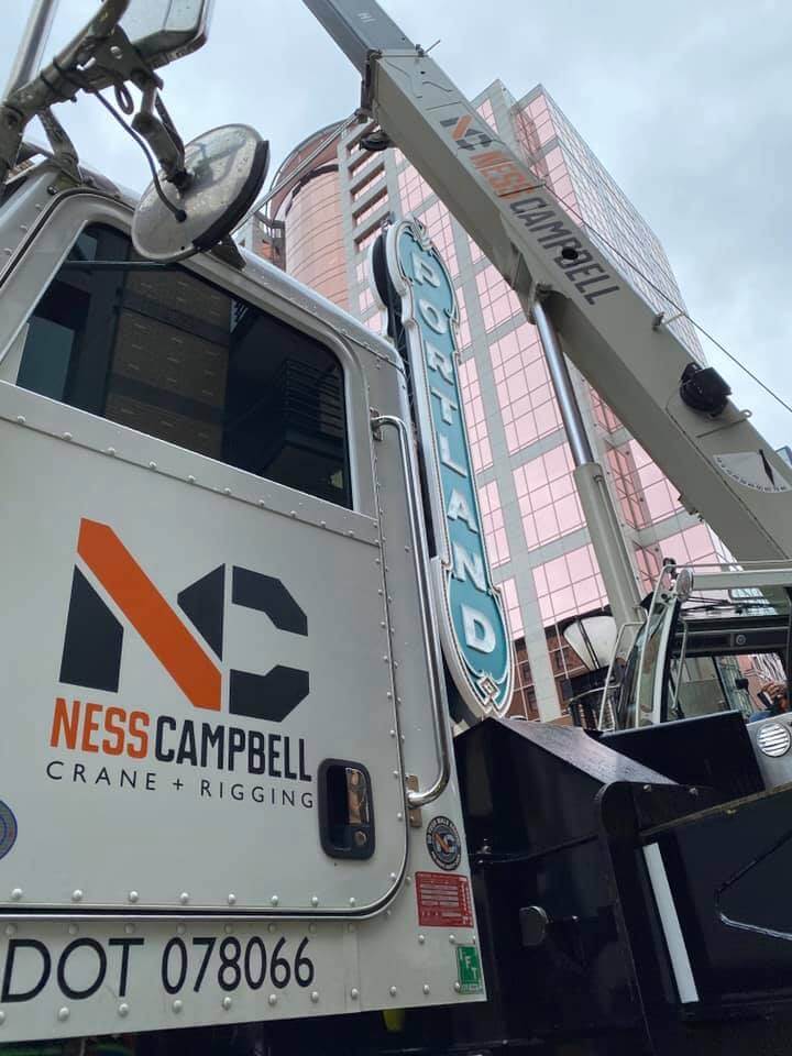
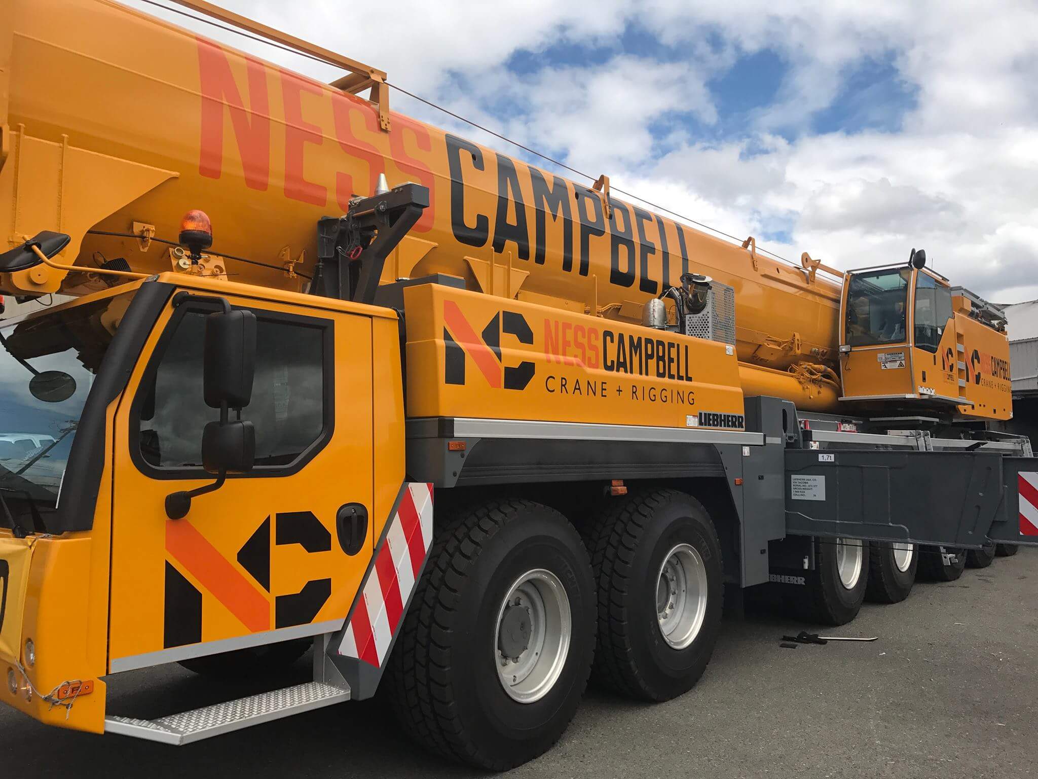
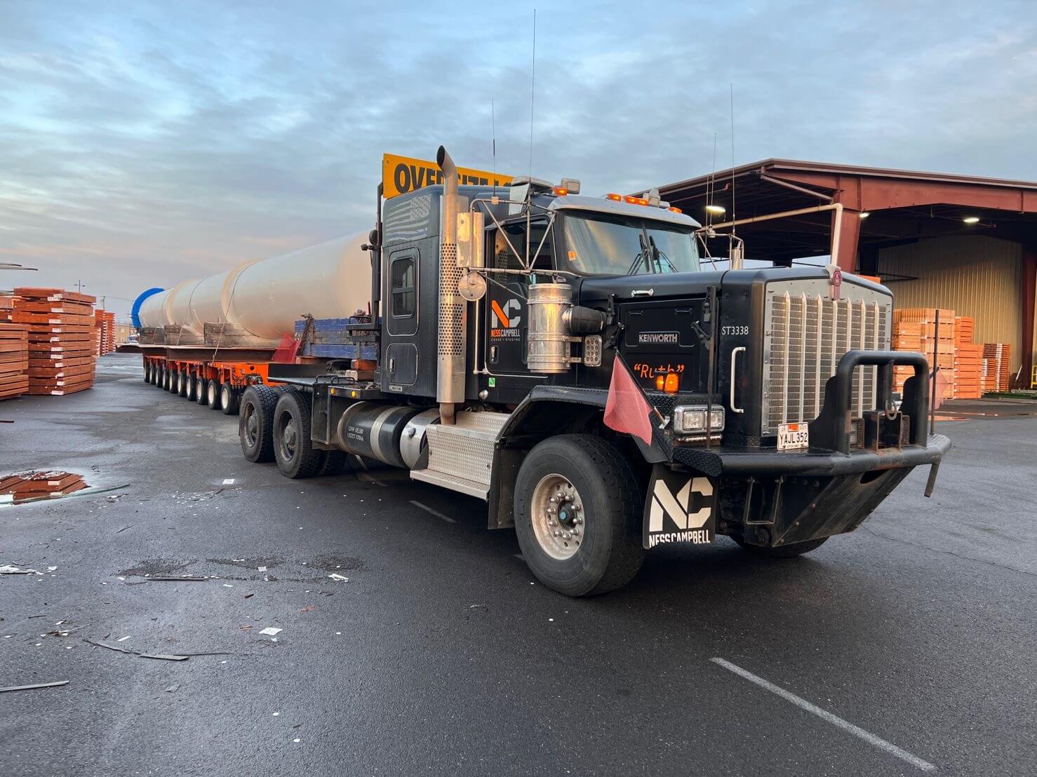
The logo and visual system were built on a foundation of 45-degree angles, a nod to the engineered precision that defines the company’s work. These angles formed shapes that hinted at the tools of the trade—wrenches, bolts, crane booms—without being overly literal. The branding extended beyond a logo. A bold pattern inspired by World War I and World War II dazzle camouflage was developed to wrap NessCampbell’s rigs, making them instantly identifiable on job sites and highways.
Dazzle camouflage was historically used on ships not to hide them but to disrupt perception, making it difficult for enemies to gauge speed and direction. The application to NessCampbell was symbolic—the brand wasn’t trying to blend in. It was designed to stand out, signal movement, and communicate power. The pattern wasn’t just for show. It was incorporated into wayfinding, directional signage, and technical schematics, reinforcing movement and precision in every aspect of the brand’s visual identity.

With the merger, NessCampbell had an opportunity to be more than just the largest crane company in the Northwest. It was a chance to create a company where the best talent in the industry wanted to work. Leadership recognized that culture was as important as equipment, and Watson helped shape the internal messaging to reflect that.
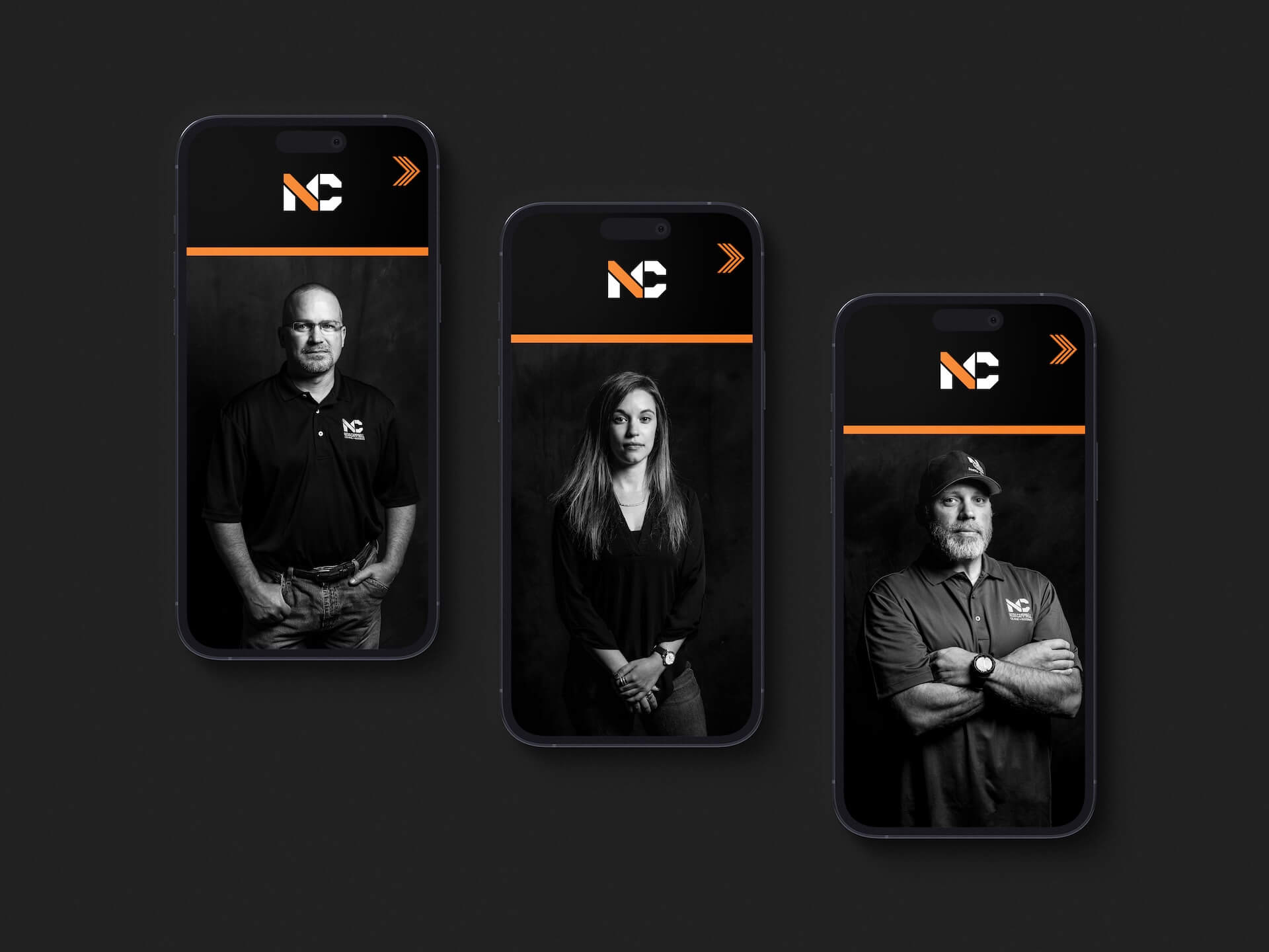
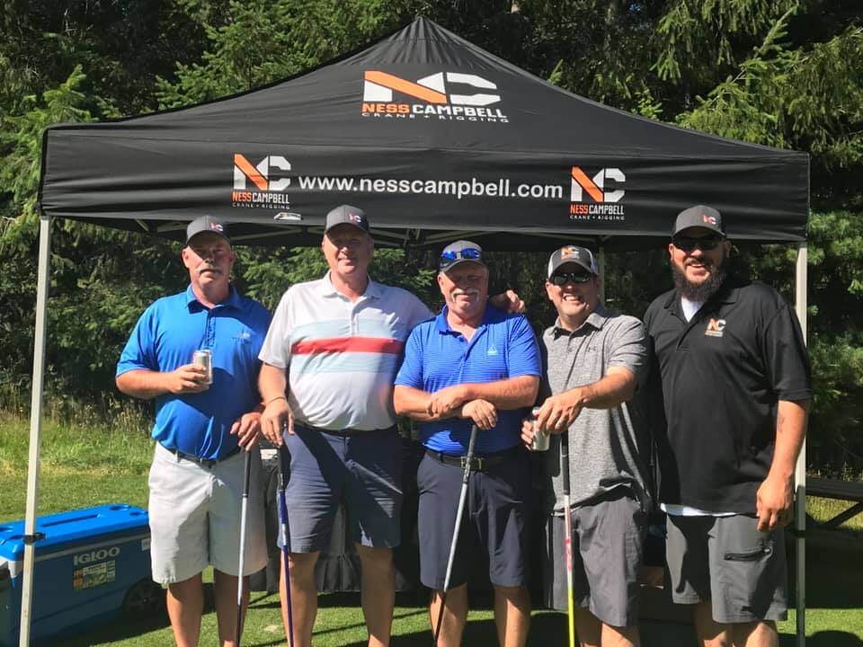
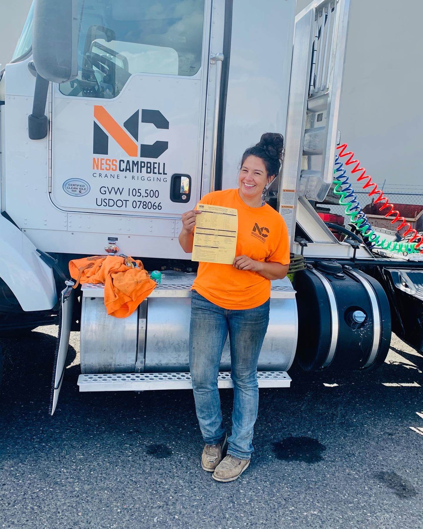
The focus was on teamwork, responsibility, and pride. Employees weren’t just running cranes or hauling massive loads; they were part of a group that anchored the most complex projects in the region. The brand became a marker of excellence, signaling that those who wore the NessCampbell logo were the best in the industry.
The brand rollout reinforced this. NessCampbell didn’t just announce a new name—it made employees feel the shift in a tangible way.


The launch event was a defining moment for the new NessCampbell. Leadership knew they had to go big, make it memorable, and give employees something to rally around.
A large venue was rented out, bringing together teams from across the company. Executives spoke about the future of the company, the meaning behind the new brand, and the culture they were building. Matt Watson took the stage to unveil the brand, walking employees through the thought process behind the design, the symbolism of the pattern, and the power of owning a brand that means something.
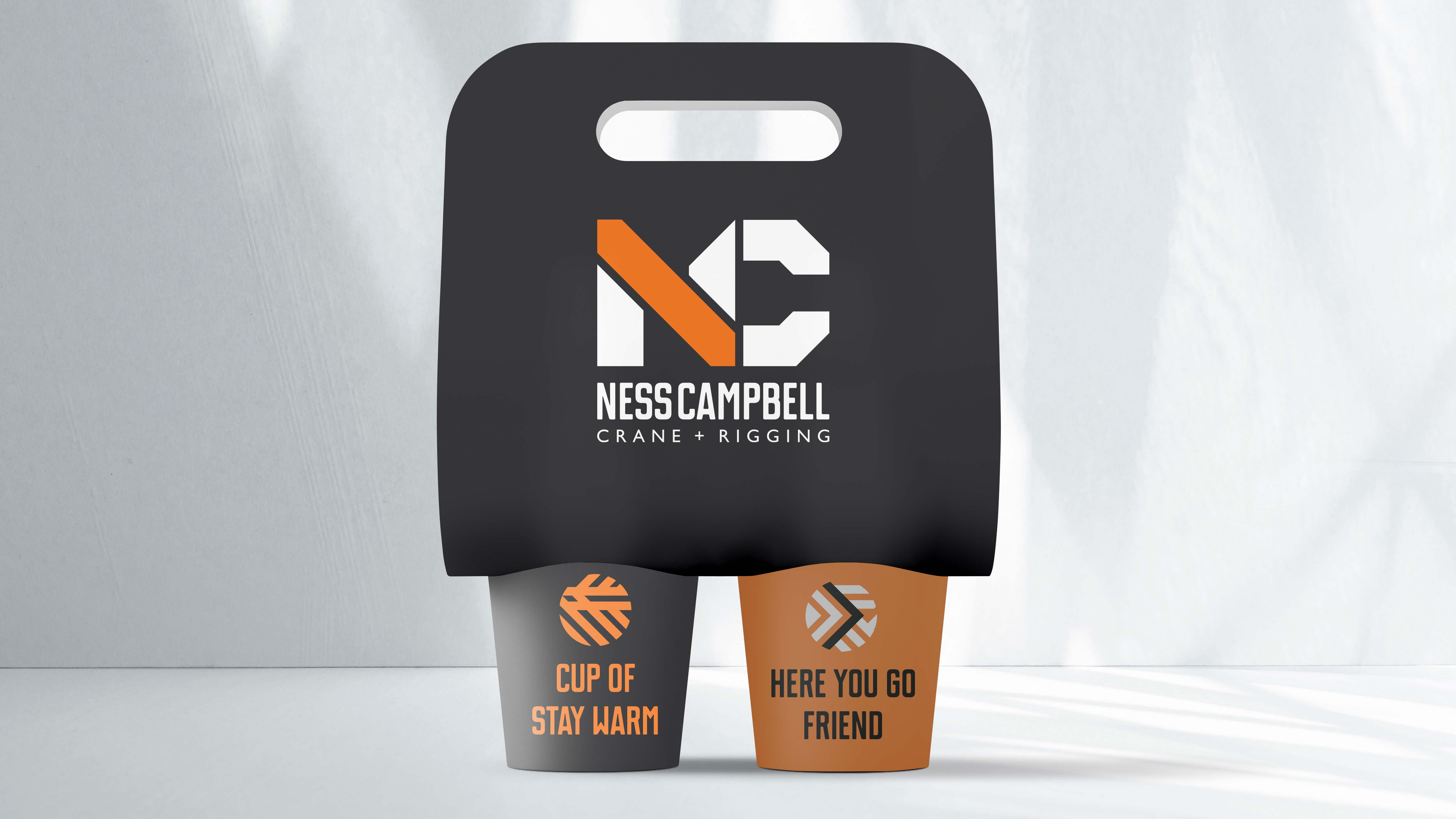
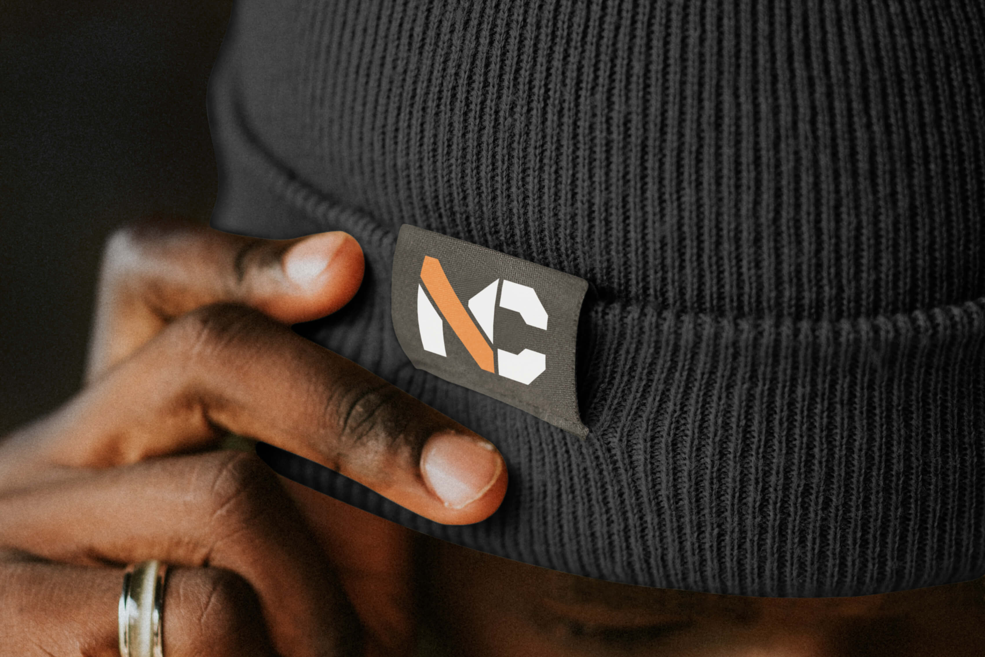
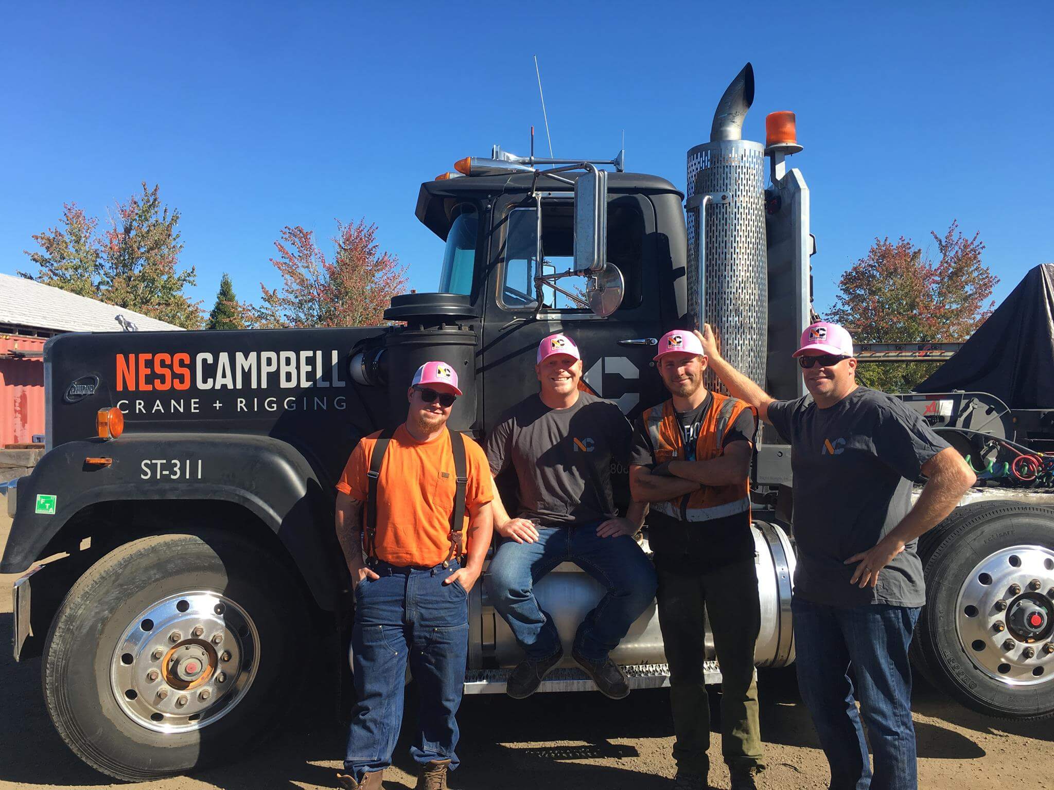
As employees left the event, they were given custom-branded gear—hats, jackets, and shirts featuring the new NessCampbell identity. But the real surprise came when they walked outside. Every truck and crane had been rewrapped in the new branding. The transformation was immediate. This wasn’t just a new logo—it was a new era for the company.
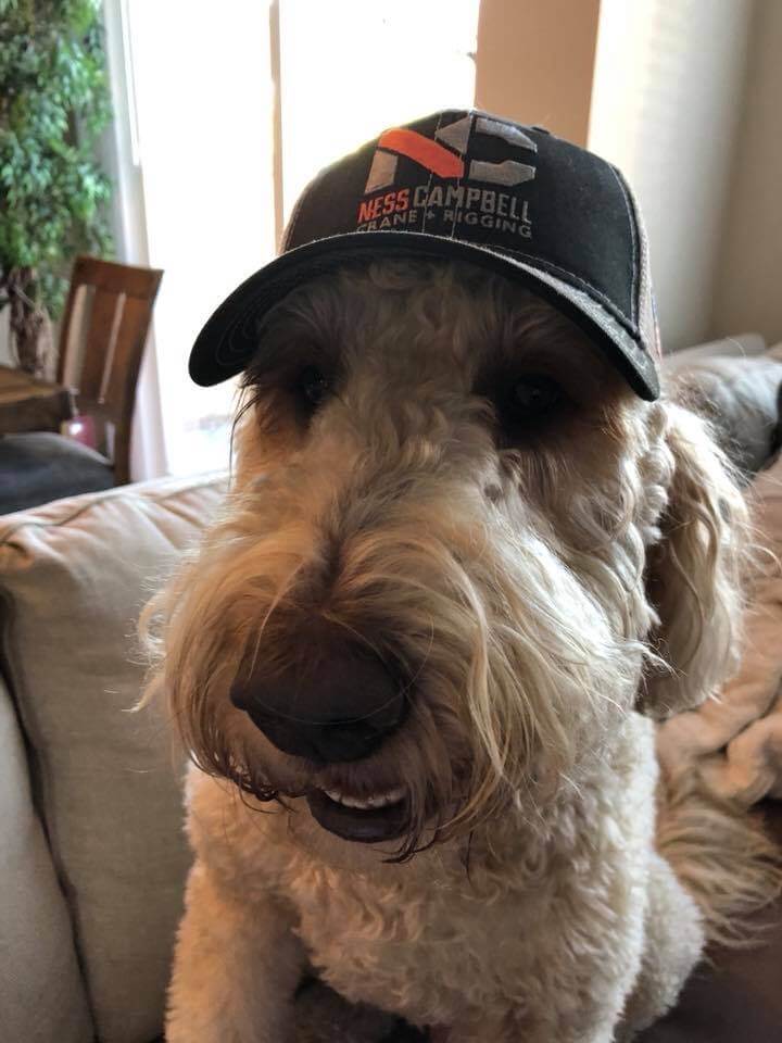
The impact of that moment has lasted. Today, NessCampbell’s branded swag, particularly their hats, has become highly sought after—not just by employees but by subcontractors, industry partners, and even competitors. Hats are “stolen” off job sites, and the demand for branded gear never slows down. It’s a testament to how well the brand resonates internally and externally. A strong brand isn’t just about looking good—it’s about giving people something they want to be part of.


Build from insight. Strategy isn’t guesswork—it’s groundwork. We listen, research, and distill what matters to guide smarter decisions and set a solid creative direction.

Make it meaningful. From naming to narratives, we create content that speaks with purpose—rooted in truth, tuned to your audience, and built to connect.
Design for behavior. We craft digital experiences that are intuitive, scalable, and aligned with how real people move, click, swipe, and search.

Bring brands to life. Physical spaces, moments, and memories matter. We design experiences that feel human—and stay with you long after the lights go out.
Drive connection. Our marketing approach blends data and instinct—getting the right message to the right people, in ways that actually move them.
Partner on progress. We work alongside your team to solve real problems, shift thinking, and build internal alignment—without the agency ego.


