Contact Us
Careers
FAQ

Bremik Construction started as a small operation in Troutdale, Oregon, with a clear passion for craftsmanship and a deep respect for the history of buildings. Founders Brent and Mike weren’t just building structures—they were restoring and reclaiming the Pacific Northwest’s architectural legacy. Today, Bremik is a leader in historic renovations and some of the region’s most challenging construction projects. Their evolution from a modest builder to an industry powerhouse required more than just skill in construction—it demanded a brand that reflected their expertise, vision, and values.


When Bremik approached Watson, they were growing fast but lacked a cohesive brand identity that set them apart in an industry dominated by firms with bold, aggressive branding. While many construction companies leaned into heavy, blocky logos that signaled strength, Bremik’s founders brought a more refined, thoughtful approach to their work—one that valued history, precision, and sustainability. The brand needed to reflect that.
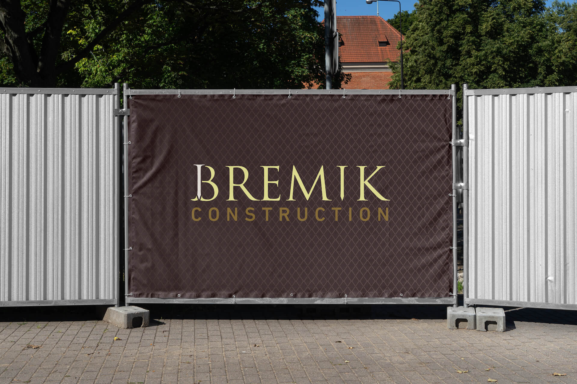
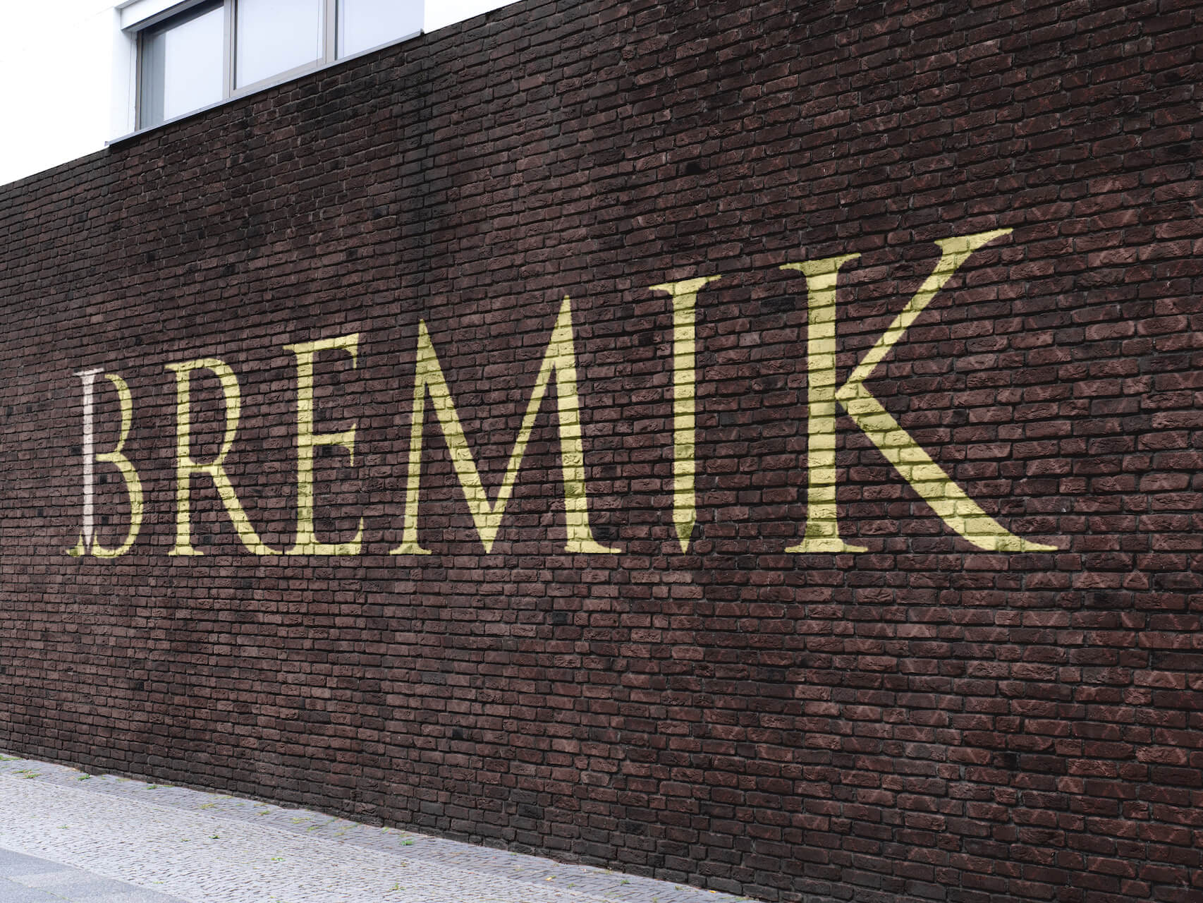
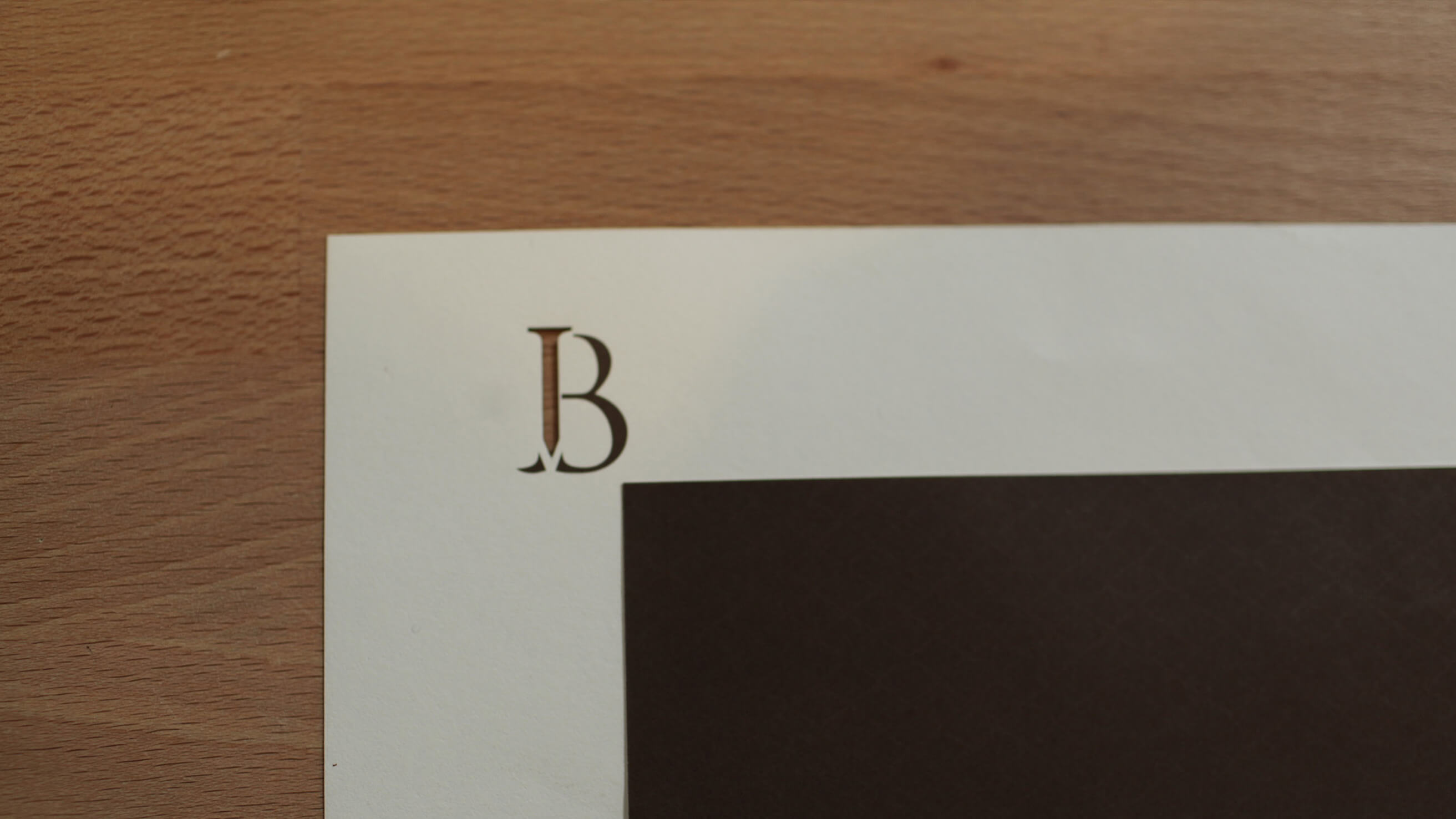
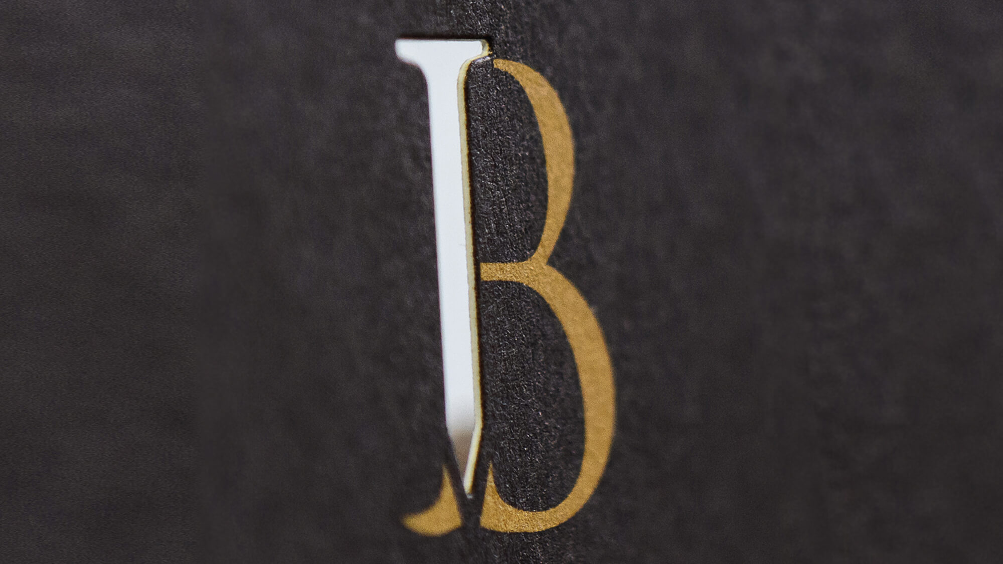
Watson developed an identity that stood out in the construction industry. Instead of the standard sans-serif, all-caps approach, Bremik’s logo embraced a serif typeface, a subtle nod to tradition and craftsmanship. A small but significant design detail—a nail subtly embedded within the letterforms—symbolized their precision and dedication to meaningful restoration. This was more than a visual decision; it was a way to articulate their philosophy: honoring the past while building for the future.
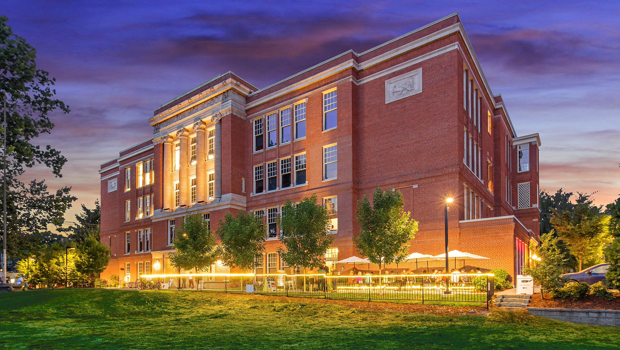


Bremik’s work spans across Portland and beyond, touching some of the most iconic projects in the region. The challenge was how to showcase the scale and impact of their work in a way that went beyond the standard portfolio of construction photos.
Watson’s approach to their website was anything but conventional. Using drone footage, the team captured a 360-degree aerial view of Portland, mapping Bremik’s completed projects across the city. This interactive feature allowed users to explore the city skyline and see Bremik’s imprint on the built environment—a far more engaging experience than static project pages.
The website also balanced technical expertise with storytelling, ensuring that it resonated not only with developers and architects but also with communities and stakeholders who cared about the legacy of their neighborhoods.


Bremik’s transformation wasn’t just about a new logo or a better website—it was about creating an identity that reflected who they were at their core. Today, they are one of the most respected construction firms in the Northwest, known for their ability to handle high-profile, historically significant projects with both care and expertise.
Their journey proves that when a brand aligns with a company’s values, it doesn’t just elevate its image—it strengthens its legacy, reputation, and future growth.


Build from insight. Strategy isn’t guesswork—it’s groundwork. We listen, research, and distill what matters to guide smarter decisions and set a solid creative direction.

Make it meaningful. From naming to narratives, we create content that speaks with purpose—rooted in truth, tuned to your audience, and built to connect.

Design for behavior. We craft digital experiences that are intuitive, scalable, and aligned with how real people move, click, swipe, and search.

Bring brands to life. Physical spaces, moments, and memories matter. We design experiences that feel human—and stay with you long after the lights go out.
Drive connection. Our marketing approach blends data and instinct—getting the right message to the right people, in ways that actually move them.
Partner on progress. We work alongside your team to solve real problems, shift thinking, and build internal alignment—without the agency ego.


