


The Psychology of Color in Branding: Forecasting Emotion, Shaping Identity

Color as a Forecast, Not a Finish
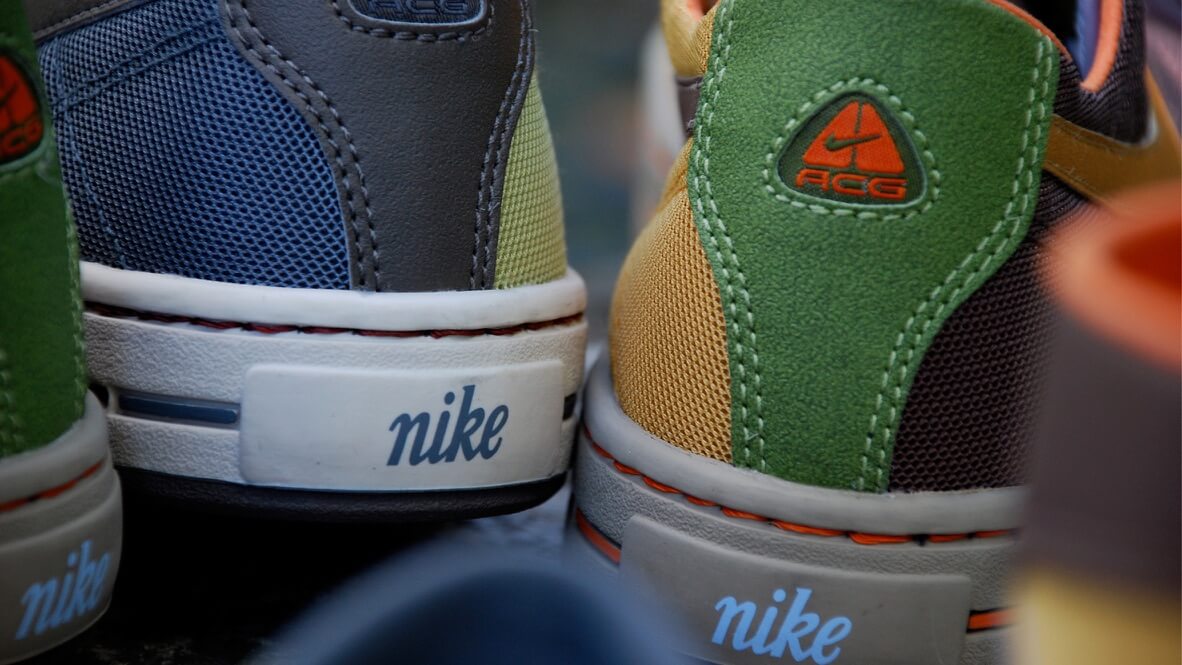
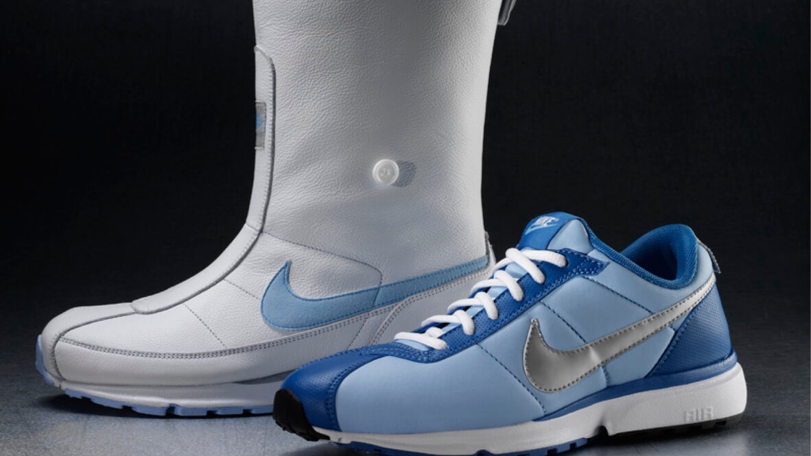
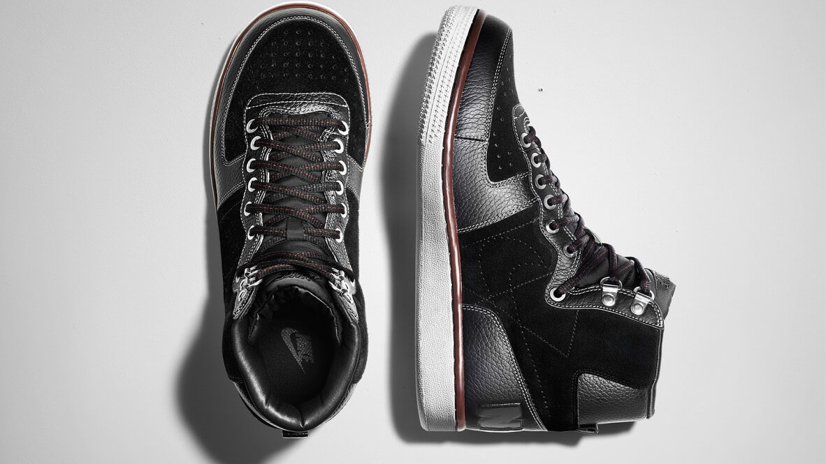
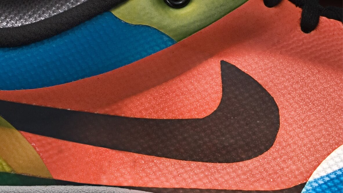
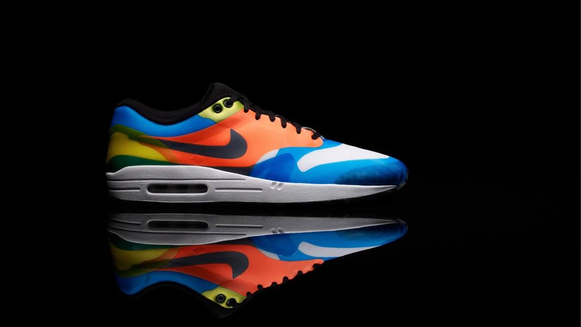
In the early 2000s, I sat on Nike’s Global Color Committee, a multidisciplinary team responsible for forecasting color stories two to three years into the future. It wasn’t about seasonal palettes or trend decks. It was a deliberate blend of science, culture, intuition, and psychology. At Nike, color wasn’t cosmetic. It was strategic. We were designing emotional response before the product ever launched.
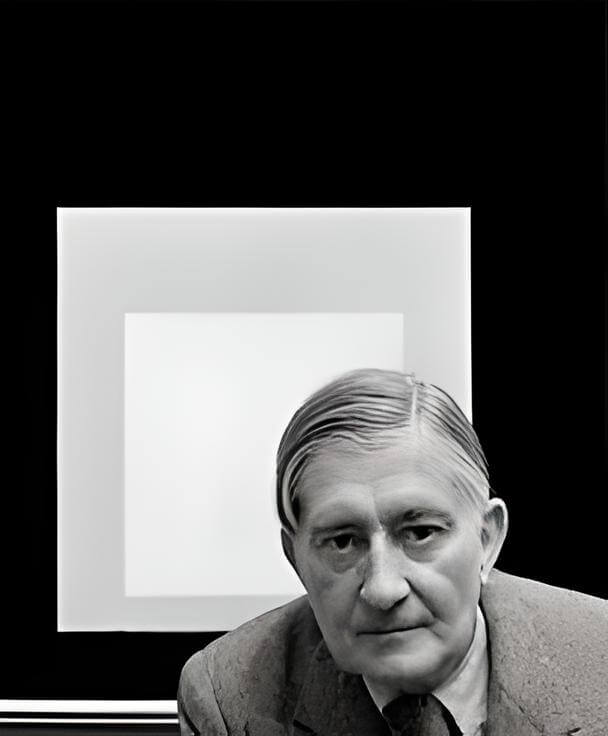
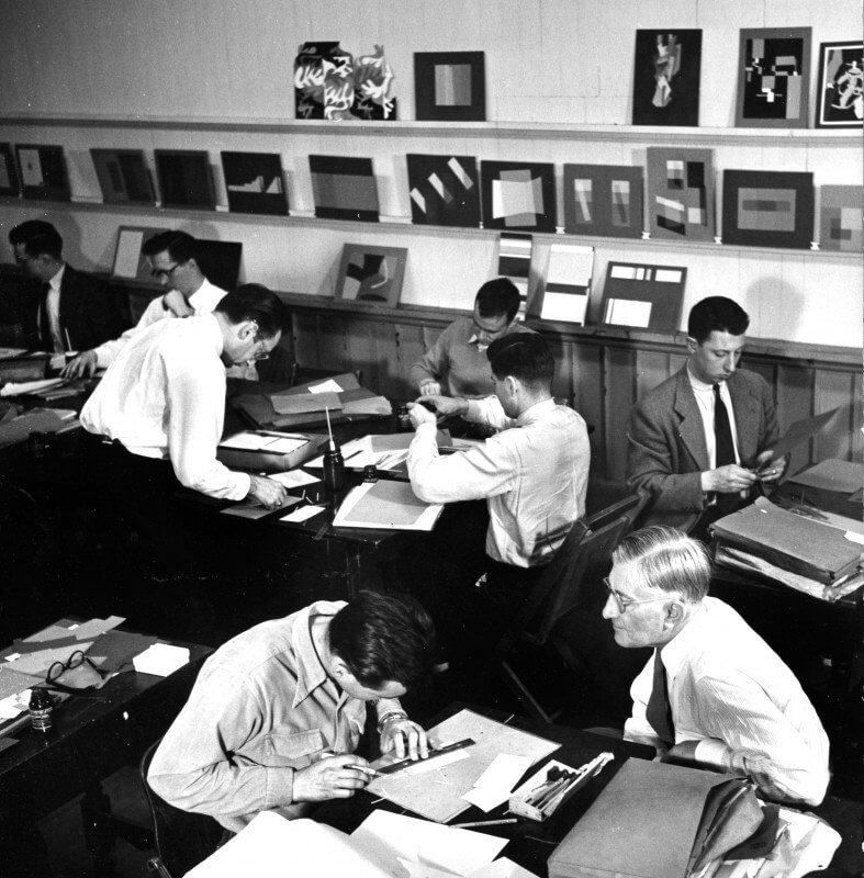
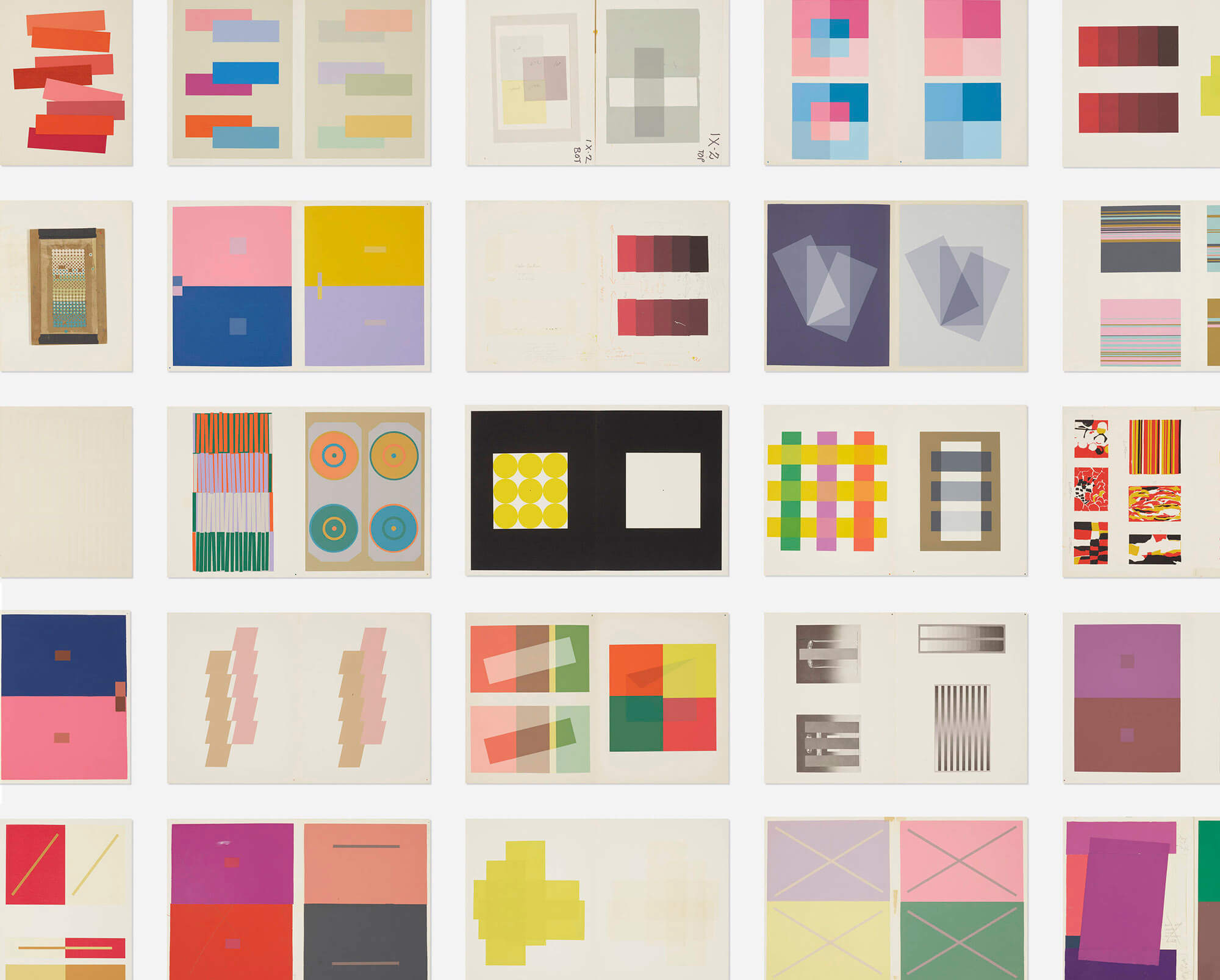
We tested color with consumers across regions, cross-referenced macrotrend forecasts, and examined how entire product lines felt when viewed as a system. One of the most formative moments came when I invited Richard Lytle to campus, a student of Josef Albers and one of the most influential color theorists of the twentieth century. Richard spoke to more than 600 Nike designers and led workshops that fundamentally challenged how we see, feel, and interpret color.
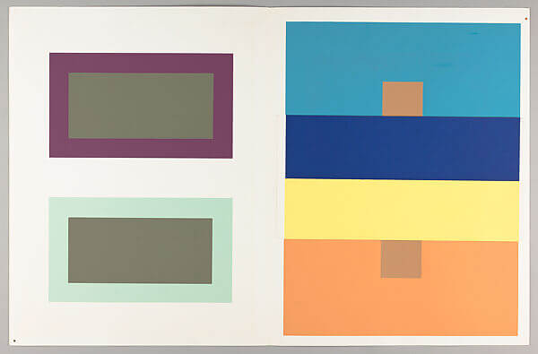
His message was simple but lasting: color is not absolute. It changes depending on context, environment, and mindset. That principle has guided my work ever since, from global consumer brands to hospitals, nonprofits, and financial institutions.
This is part science, part story. It is an exploration of how color shapes identity, builds trust, and creates emotional connection.
Color Isn’t a Trend. It’s a Trigger.
Color works faster than language. Before a word is processed or a logo is recognized, the brain reacts to hue, contrast, and saturation. Research published in Management Decision suggests that color accounts for 62–90% of first impressions. That makes it one of the most powerful tools in branding and one of the most underestimated.
Red signals urgency, passion, and risk, which explains its dominance in fast food and clearance campaigns. Blue conveys calm and reliability, making it a staple in finance and technology. Green evokes renewal, health, and sustainability. These associations are cultural, but they are also physiological.
Chromotherapy, the practice of healing through color, dates back to ancient Egypt, China, and India. In modern medicine, blue light is used to treat neonatal jaundice, while warmer tones are often applied in learning environments to support focus and alertness.
One particularly compelling study by Henner Ertel found that schoolchildren exposed to classrooms painted in yellow, orange, light green, and sky blue showed a measurable increase in IQ scores, along with improved behavior and social cohesion. Notably, similar benefits were observed among blind students, suggesting that our bodies respond to light and color energy beyond conscious sight.
Color, then, is not merely visual. It is biological. It can calm or stimulate, focus or distract, attract or repel. When used with intention, it transforms passive audiences into believers.



Why Color Choice Can Make or Break Brand Trust
Every branding decision signals intention. Typography, tone of voice, photography, and motion all matter. But color often carries the heaviest emotional load, especially in moments of split-second judgment.
We trust blue. Brands like Visa, IBM, and LinkedIn rely on its psychological weight, not coincidence. Red can energize, but excess risks signaling danger. Green can feel clean or clinical, depending on tone and context.
I once worked with a healthcare nonprofit serving individuals on the autism spectrum. Color became one of the most sensitive aspects of the rebrand. Many in their audience experienced sensory sensitivities, which required testing palettes not just for aesthetics, but for emotional resonance, inclusivity, and accessibility.
At Watson, color conversations never start with preference. They start with emotion. We ask how an audience should feel, then explore how hue, saturation, and contrast can bridge intention and perception.
Trust, ultimately, is the emotional return on branding.
Accessibility in Color: Designing for Everyone
Approximately 300 million people worldwide experience some form of color blindness. Combined with the growing demand for digital inclusivity, accessible color usage is no longer optional.
The Web Content Accessibility Guidelines define minimum contrast ratios, but accessibility extends beyond compliance. It is about equity.
At Watson, color is foundational, not decorative. In a project with a state health agency, every color was tested across ADA standards for print, web, signage, and motion. We involved users with low vision and neurodivergent perspectives throughout the process. The result was not only accessible, but more effective for everyone.
Accessibility also requires understanding material behavior:
- Colors that read clean on screen may collapse in print
- High-saturation hues may blur in motion or video
Designing for accessibility is designing for longevity.
The Evolution of Brand Color Systems
Two decades ago, choosing brand color often meant selecting a Pantone swatch and hoping it scaled. Today, color exists within responsive systems. It must perform across dark mode, adaptive interfaces, global markets, and cultural contexts.
We now see the rise of what we call color intelligence: a data-informed approach that blends trend forecasting, cultural insight, accessibility standards, and emotional impact.
Some macrothemes shaping color systems today include:
- Biophilic Calm: earth tones and oceanic blues tied to wellness and sustainability
- Synthetic Glow: digitally native neons influenced by gaming and immersive UX
The future belongs to dynamic palettes. Systems that adapt by context, time of day, or user behavior are already emerging. Platforms like Spotify and Netflix have begun experimenting with this flexibility. As personalization deepens, color’s role in shaping experience will only expand.
Color is not fixed. It is a living language.
Mood-Responsive Design and What Comes Next
We are entering an era where brand systems flex emotionally. Just as music platforms curate mood-based experiences, future interfaces will adjust color based on cognitive load, environment, or user state.
Imagine a health app that softens its palette after poor sleep. Or a learning platform that adjusts contrast and warmth to support focus. In this future, color becomes empathetic, not expressive.
Watson is already prototyping these systems, combining motion, modular identity frameworks, and real-time feedback loops to ensure color supports behavior, not just aesthetics.
What I Learned from Richard Lytle
When Richard Lytle held blocks of color on stage at Nike, he didn’t lecture. He invited us to see differently. What appeared stable on screen shifted entirely when placed in new contexts.
That relativity of perception, of meaning, of emotion has followed me throughout my career.
At Nike, we weren’t just forecasting color. We were forecasting emotion. That work now extends to every brand we touch.
Color is not a layer applied at the end.
It is the thread that runs through everything.
See you out there.
What I Learned from Richard Lytle
When Richard Lytle held blocks of color on stage at Nike, he didn’t lecture. He invited us to see differently. What appeared stable on screen shifted entirely when placed in new contexts.
That relativity of perception, of meaning, of emotion has followed me throughout my career.
At Nike, we weren’t just forecasting color. We were forecasting emotion. That work now extends to every brand we touch.
Color is not a layer applied at the end.
It is the thread that runs through everything.
See you out there.