


Autism Society of America: National Nonprofit Branding Rooted in Connection

For nearly six decades, the Autism Society of America has served as a lifeline, connecting individuals and families to education, advocacy, and support. But even the most established institutions must evolve alongside the communities they serve.
As the population of Autistic individuals grows and cultural conversations around diagnosis, language, and identity continue to shift, the organization recognized a pivotal moment. This was not simply a visual refresh. It was a strategic inflection point.
The goal was clear: create a brand that could reflect the full spectrum of lived experience, affirm dignity across identities, and unify a national network of 75 affiliates under one cohesive voice. The Autism Society was not interested in surface-level change. It needed a brand built with the community, not merely for it.
What followed was a rebrand designed to carry emotional weight, political nuance, and operational clarity, while remaining grounded, inclusive, and durable.
Why National Nonprofit Branding Demands More Than a Mission Statement
For Watson Creative, the challenge was defined early. The brand needed to be rooted in connection, but anchored by clarity.
The Autism Society’s previous identity struggled to reflect the diversity of its community or the evolving language surrounding Autism. Messaging varied widely across affiliates, and there was no shared narrative strong enough to unify local and national efforts.
To succeed, the rebrand had to accomplish three things:
- Clarify the organization’s unique role within the broader Autism landscape, balancing clinical, cultural, and lived perspectives.
- Unify a national network without erasing local autonomy.
- Design for accessibility, extending beyond compliance to emotional and sensory safety.
This was not a branding exercise in aesthetics. It was a systems-level transformation.
Building a National Brand With and Not Just For the Autism Community
Inclusive Discovery Across the Spectrum
The process began with listening.
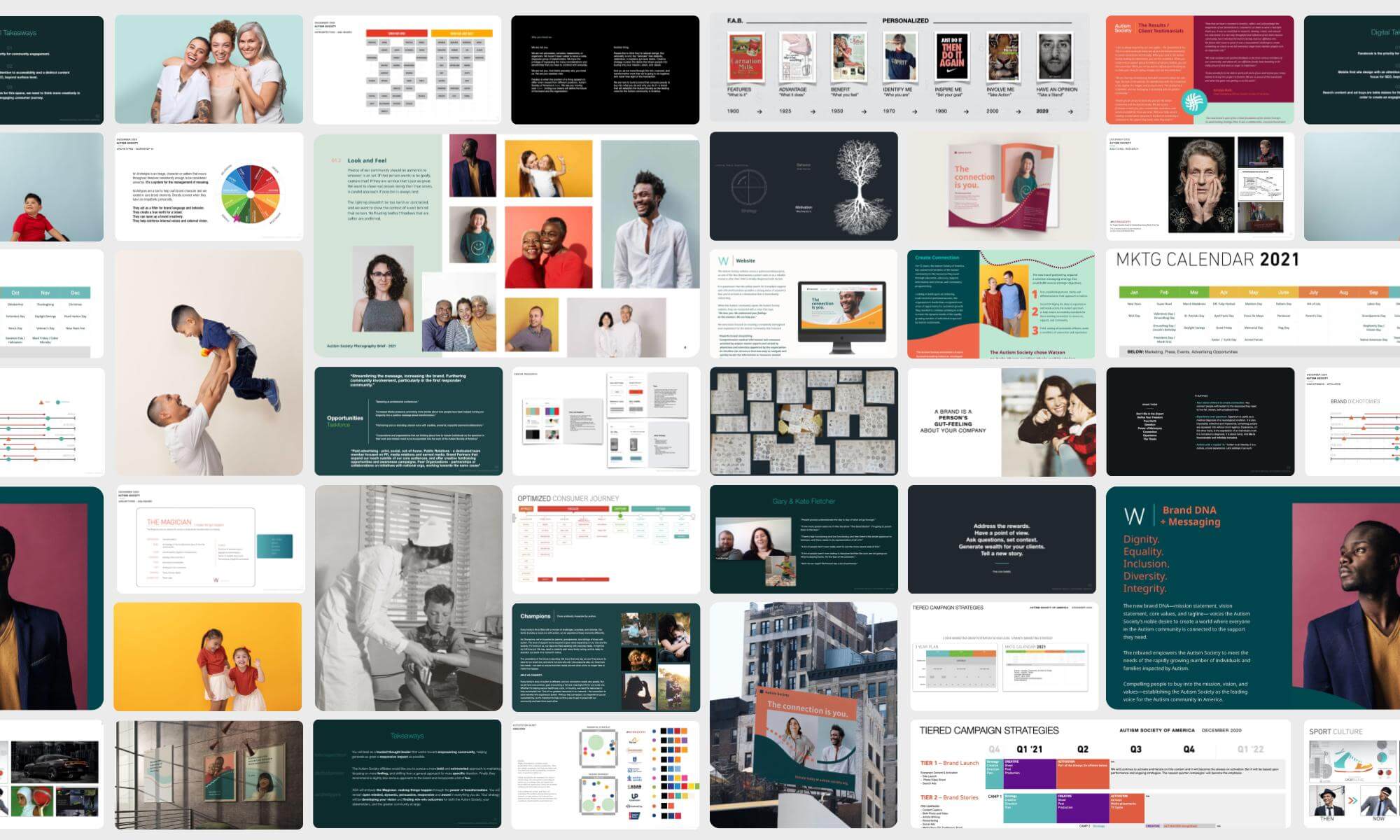
More than 150 stakeholders participated over the course of a year, including Autistic self-advocates, parents, caregivers, affiliate directors, researchers, board members, and community partners. Research extended far beyond surveys and white papers. It was conversational, immersive, and intentionally paced.
Workshops, interviews, and roundtables engaged:
- Adults and children on the Autism spectrum
- Families across different life stages
- Clinical experts and researchers
- Affiliate leaders nationwide
- The Autism Society’s executive and strategic planning teams
Daily alignment ensured feedback loops remained human and decisions stayed grounded in lived reality.
The Strategic Insight: Disconnection
One insight surfaced repeatedly during the audit process: disconnection.
Disconnection from resources.
Disconnection from one another.
Disconnection from a shared narrative.
Connection became more than a theme. It became the organizing principle.
The new brand needed to provide:
- A working definition of Autism that could evolve over time
- Messaging capable of holding nuance across identities and viewpoints
- A shared language for storytelling across local and national chapters
Connection was not decorative. It was structural.
Rebranding for Accessibility Requires Emotional Precision
Designing With Sensory Sensitivity at the Core
Accessibility informed every creative decision. Not as a checklist, but as a baseline.
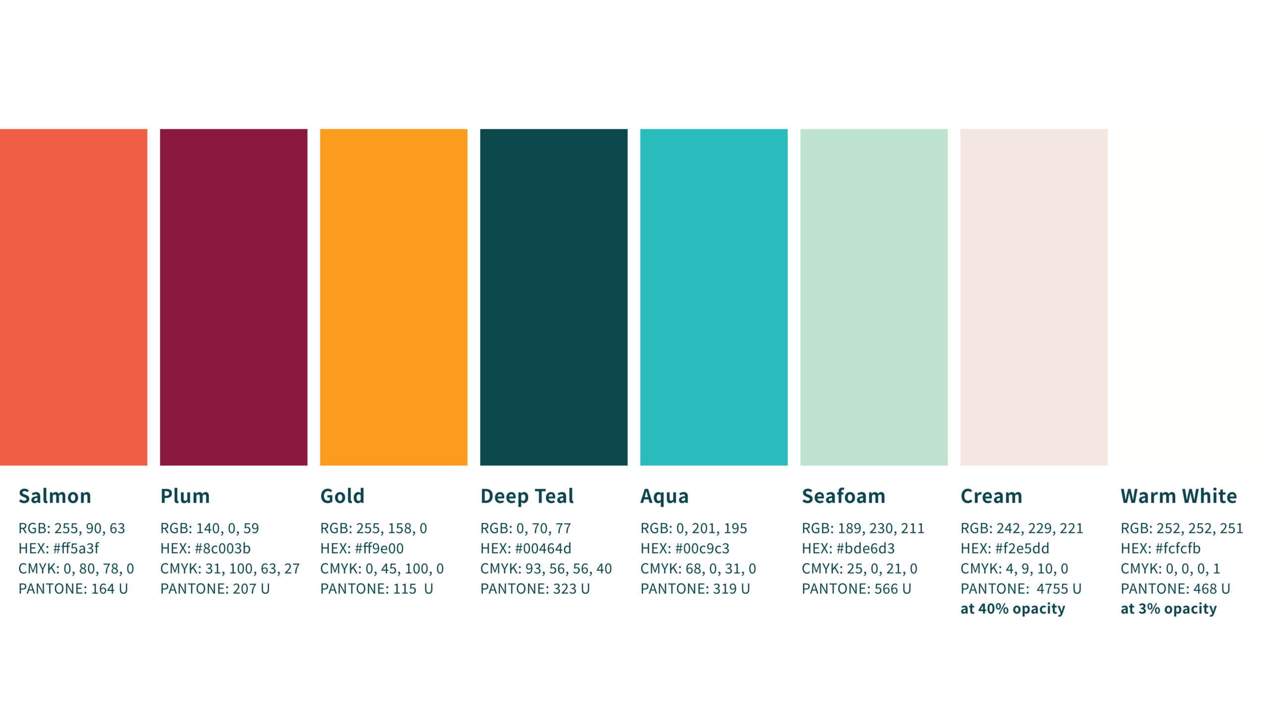
Color palettes, typography, motion, and navigation were tested with Autistic individuals and caregivers. WCAG standards were treated as a floor, not a ceiling. Feedback shaped refinements at every stage.
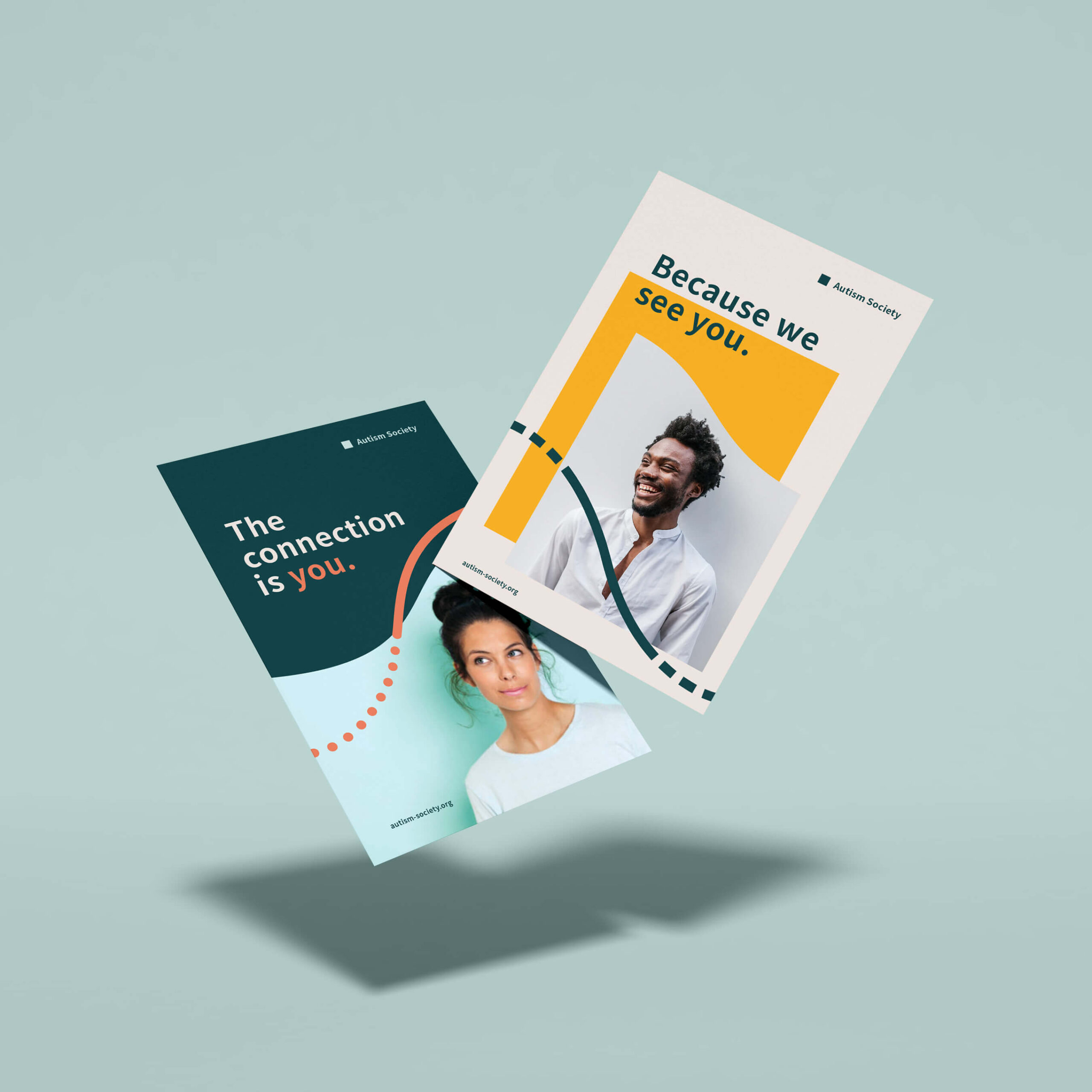
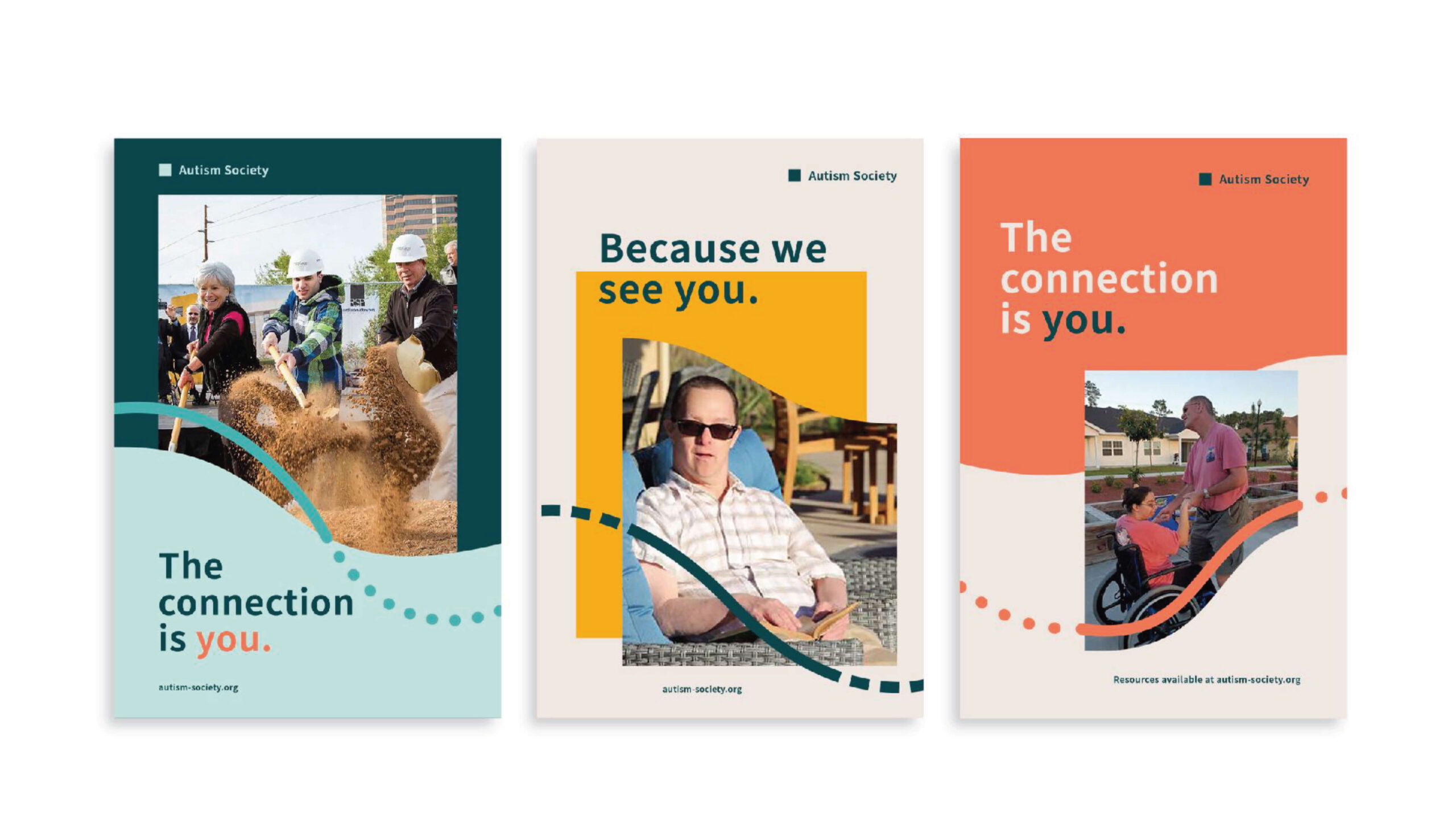
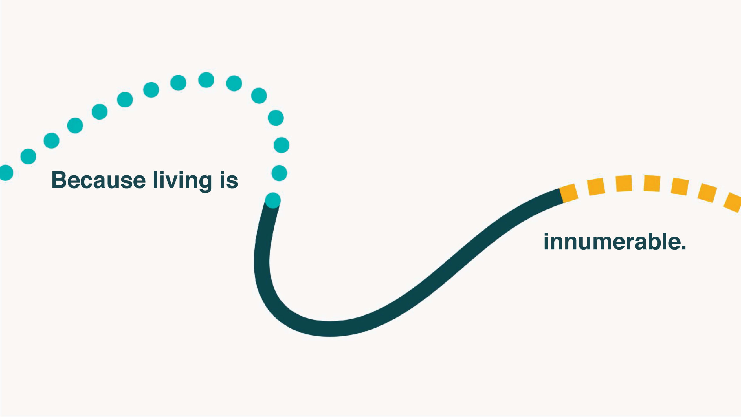
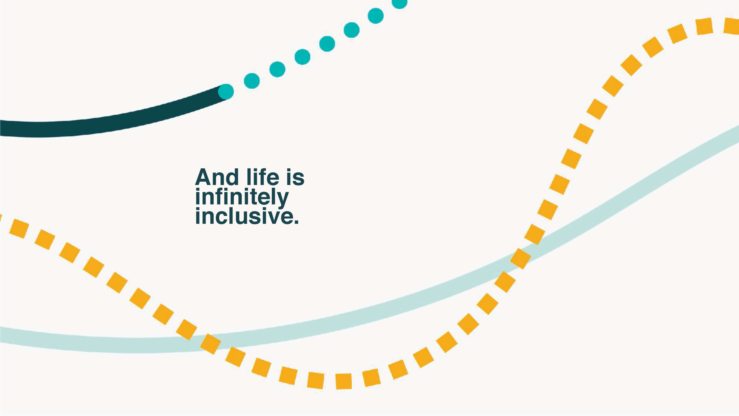
The creative system centered on a unifying visual thread. Soft lines and fluid forms reflected interconnectedness across the spectrum. The resulting toolkit included:
- Inclusive color and typography systems
- Flexible templates for affiliate use
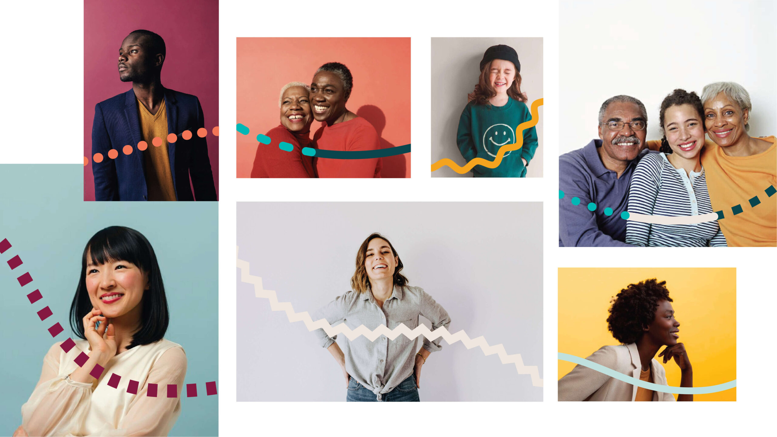
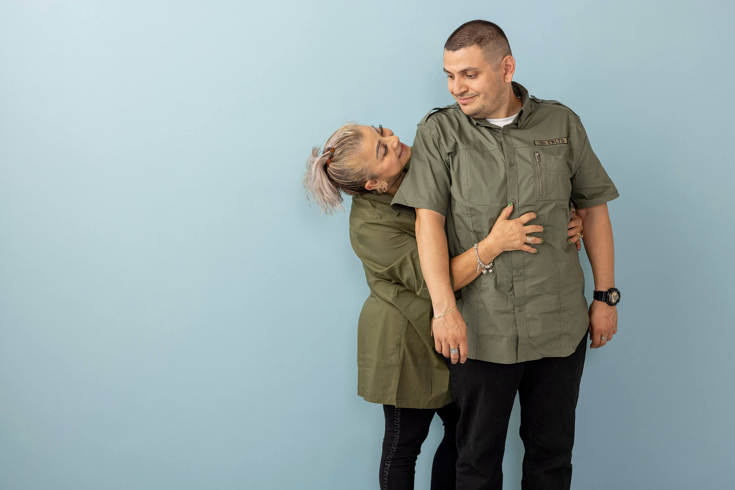
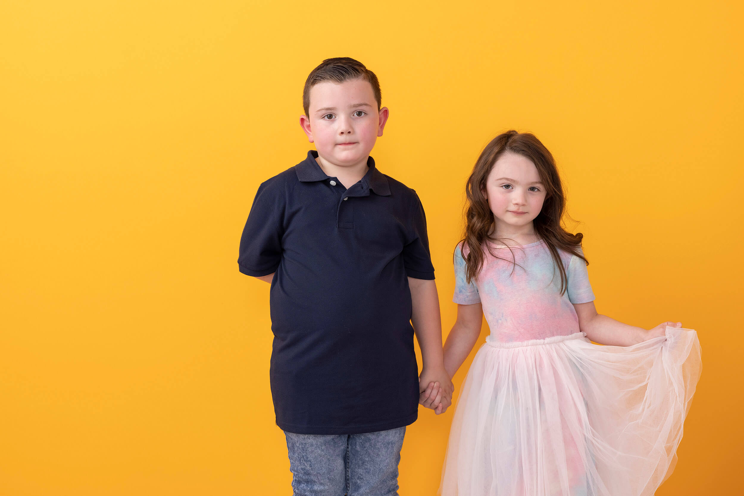
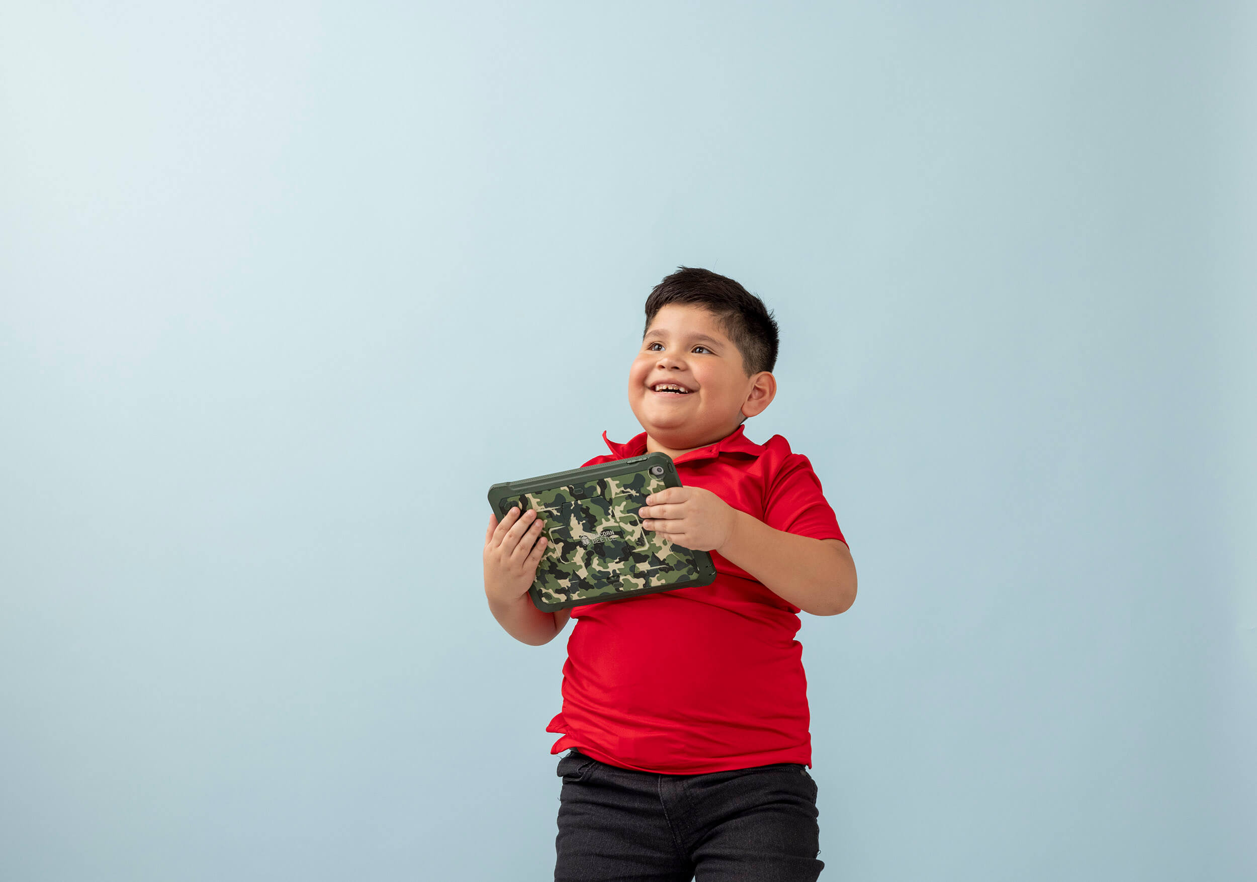
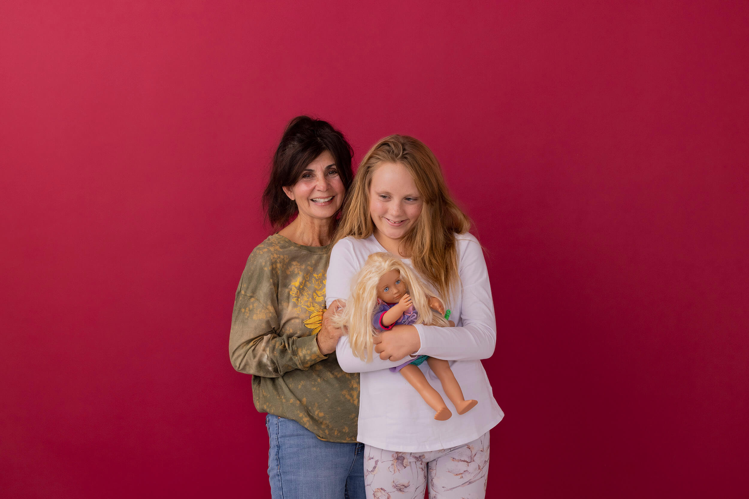
- Photography grounded in real people and real stories
The design system balanced consistency with adaptability, ensuring the brand could scale without becoming rigid.
Representation, Trust, and the Power of Real Imagery
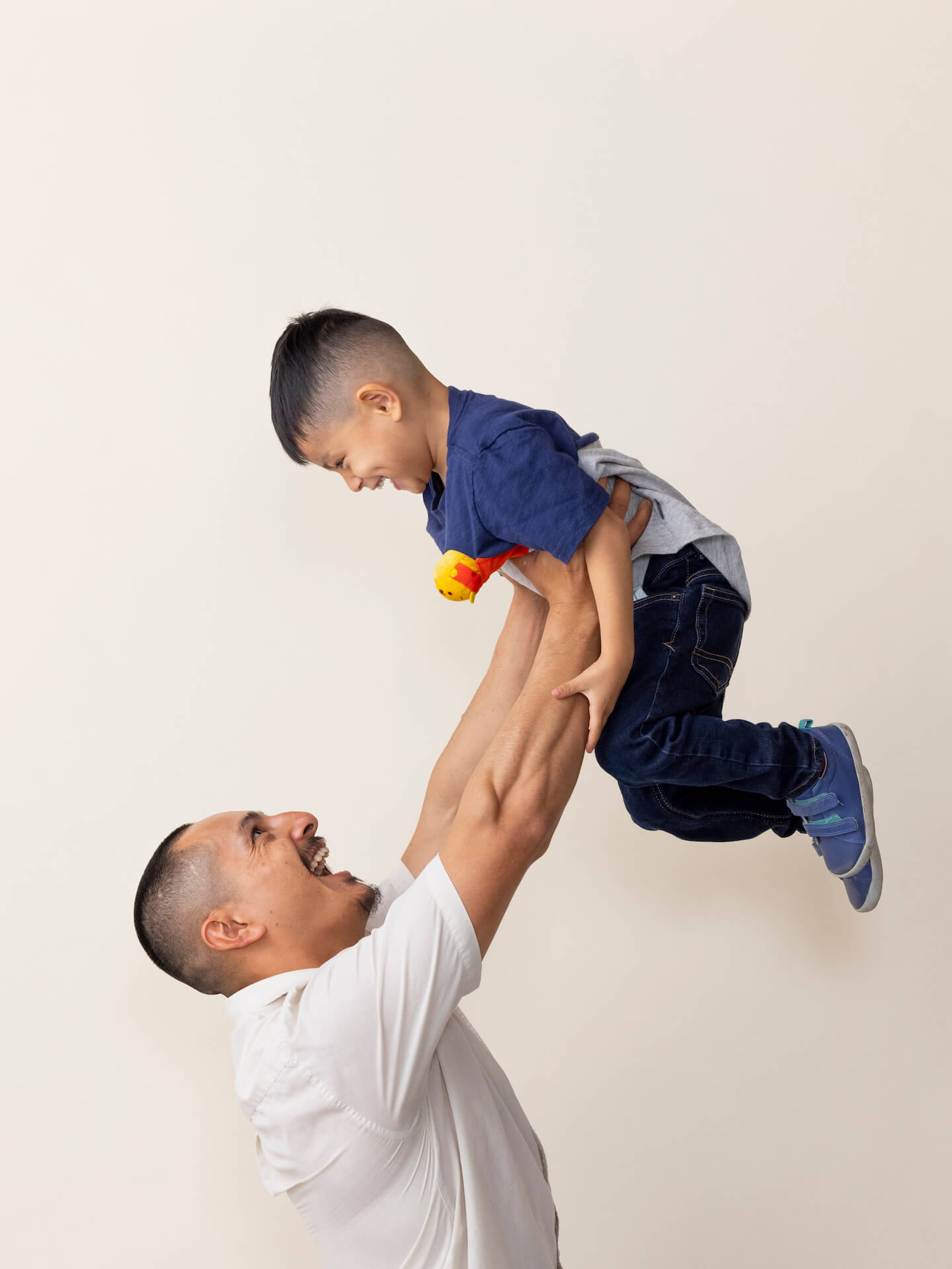
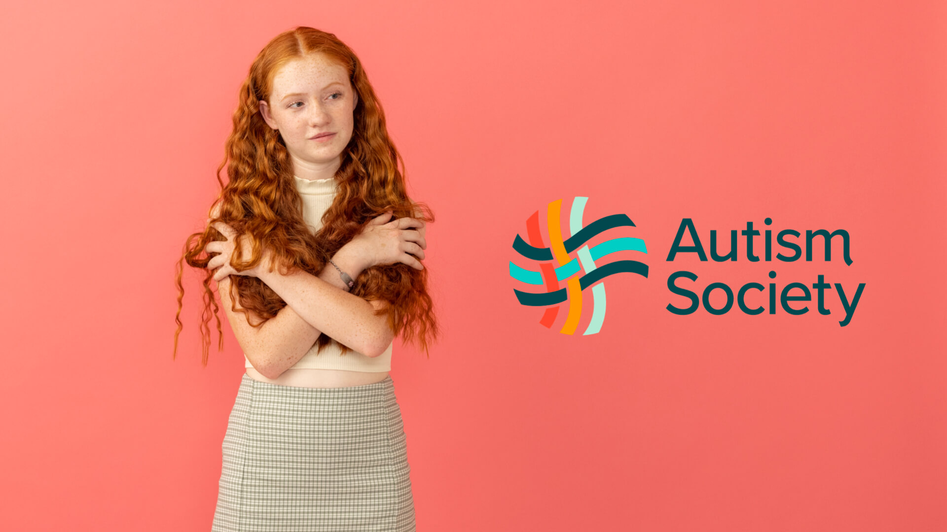
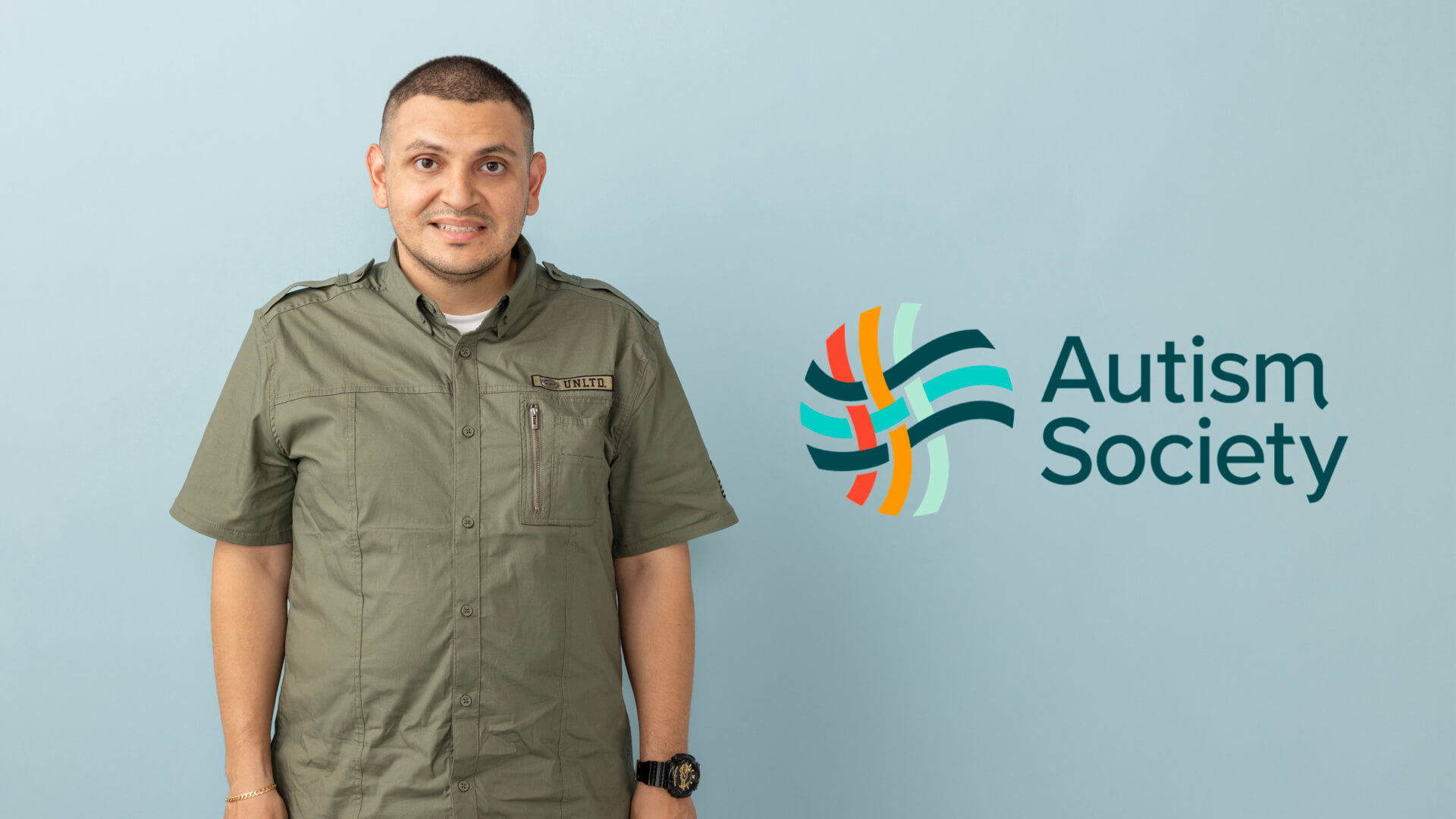
Brand photography became one of the most emotionally resonant elements of the project.
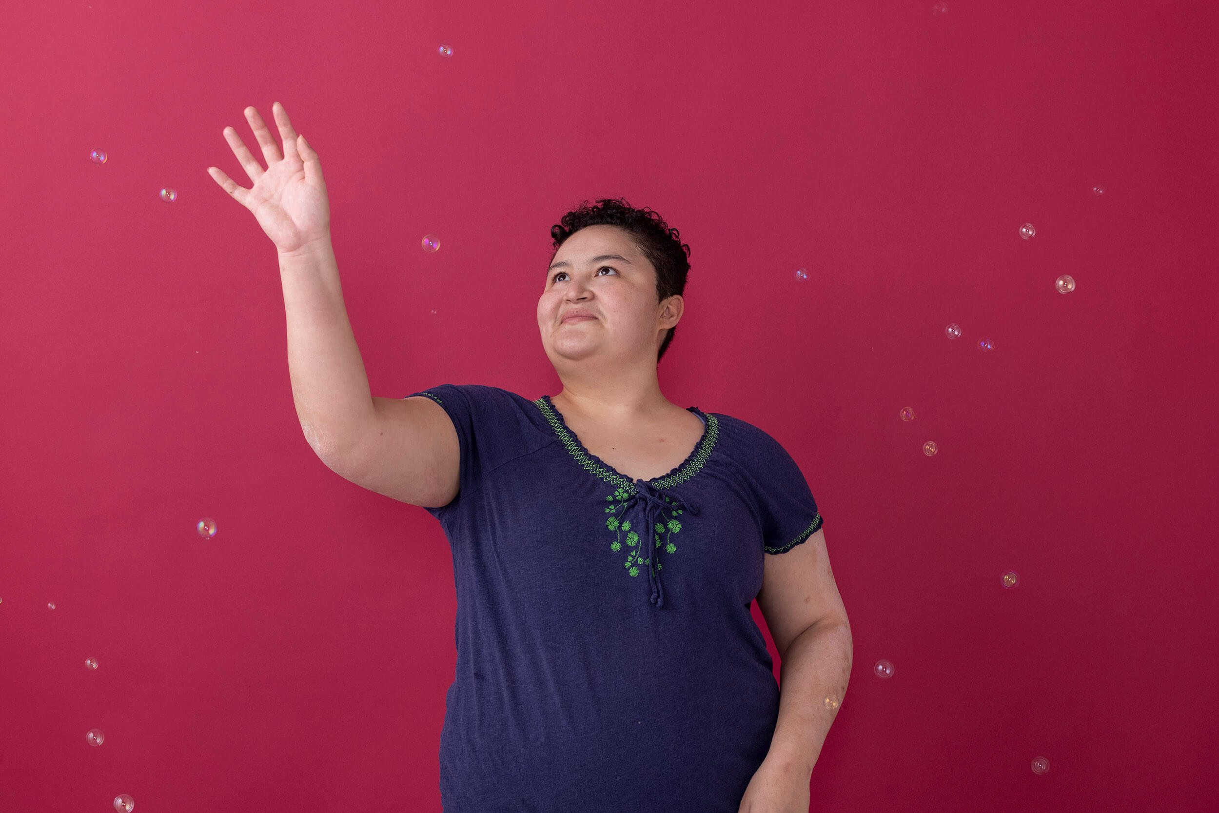
Participants shared moments of vulnerability and trust, often stepping beyond personal comfort zones. These moments were not staged or curated. They were lived.
The resulting imagery reflects strength, diversity, and authenticity. It offers recognition rather than abstraction, allowing individuals and families to see themselves represented with dignity.





Delivering a National Brand Platform for Long-Term Impact
The Tagline: The Connection is You
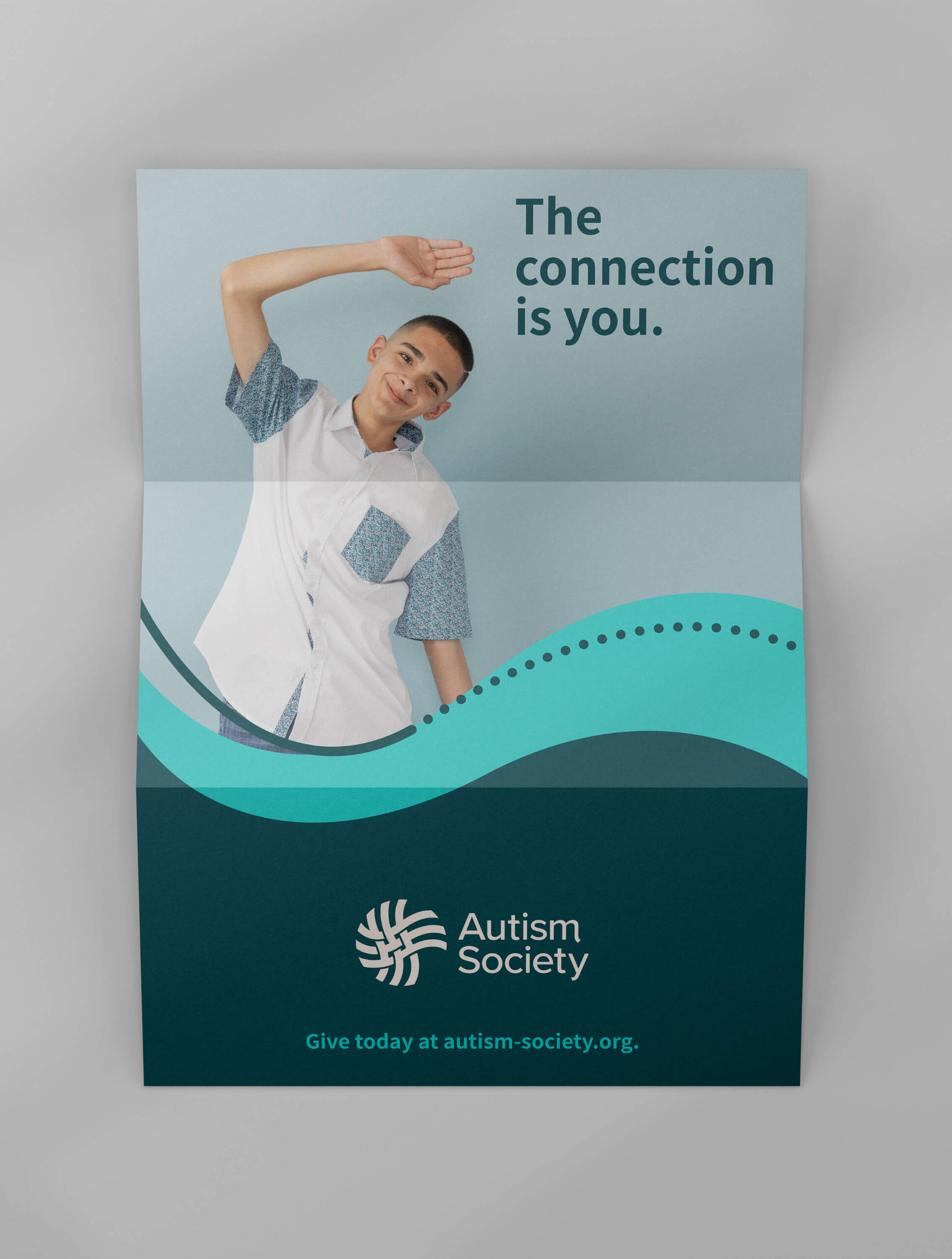
The brand crystallized around a simple but powerful idea: The Connection Is You.
More than a tagline, it functioned as a call to action. It positioned every individual as an active participant in the community, reinforcing ownership and agency across the network.
Connection was no longer something the organization provided. It was something the community embodied.
Website as a First Responder
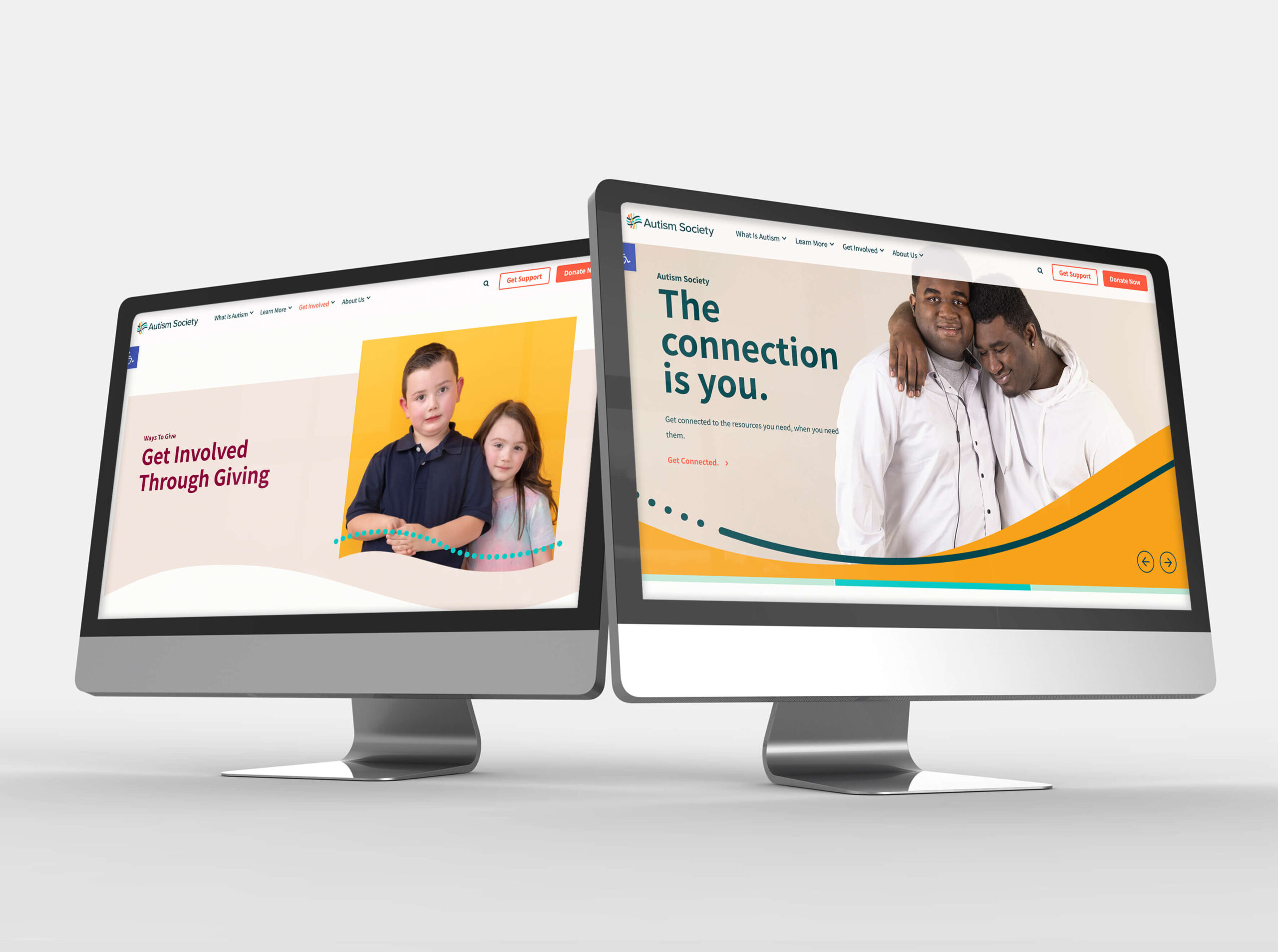
For many families, the website is the first point of contact following a life-changing diagnosis. It needed to meet urgency with empathy.
The digital experience was redesigned around a single emotional message: We hear you. We’re with you.
The new site prioritizes:
- Expert-vetted medical information
- Clear navigation for urgent questions
- Empowering storytelling over clinical distance
- Visual warmth grounded in real community voices
The result is a platform that informs without overwhelming and supports without judgment.
Branding That Scales Across 75 Affiliates
To ensure longevity, Watson delivered a comprehensive brand system. Messaging frameworks, visual guidelines, and onboarding resources allow affiliates to align nationally while remaining responsive to local needs.
The system was designed for coherence, not uniformity. Flexibility was essential.
Strategic Outcomes and Lasting Resonance
Feedback from leadership and affiliates confirmed the impact. The new brand has strengthened identification, increased pride, and provided a foundation for the organization’s long-term strategic plan.
More importantly, it has reinforced trust across the community.
What Nonprofits Can Learn From This Rebrand
Invite the Community In
Rebrands imposed on a community rarely endure. Rebrands built with a community create momentum and shared ownership.
Build Emotional Infrastructure
Nonprofit brands must support people emotionally, not just inform them. Language, visuals, and interactions matter as much as services.
Design for Real Life
Accessibility means designing for moments of vulnerability, confusion, and urgency. Compliance is not enough.
A Human Ending
This rebrand was not about replacing an identity. It was about revealing one that already existed.
The brand lives in the self-advocate finding their voice, the parent discovering community, and the child seeing themselves reflected with dignity. This is what nonprofit branding can achieve when it begins with people, not platforms.