Project Description
From depositing that first paycheck, opening a college fund for the kids, or running a small business, Community First Bank is there. It’s a legacy embodied by the people the bank serves—the individuals, families, and businesses that make the Tri-Cities community strong.
When you have the opportunity to rebrand an organization like this, you go all in.
Balancing a new direction with tradition
Banks are tricky rebrands. By nature, the institutions are conservative (some more so than others). Move the needle, but satisfy all stakeholders. It’s tough. You need a strong strategy to get it right.
We dove deep. Our team spent a lot of time on the ground in Tri-Cities, Washington, talking with bank customers (big and small), employees, and leadership. We had to see the story from all sides to nail the rebrand.
Lucky for us, the good people at Community First Bank were ready to take a few chances
“Such an exciting ride! Whatever the challenge, Watson Creative always stepped up to the plate. We’ve greatly appreciated their time, patience, and creativity.”
ANTOINETTE BURNSIDE, ASSISTANT VICE PRESIDENT AND MARKETING DIRECTOR


Community is tight in the Tri-Cities. The new brand had to convey the decades of trust that the people of the Tri-Cities had placed in the bank. Approachable, but not loose. Confident, but not pompous. Professional, but not stuffy. Everything we did had to express how the bank helps its customers live strong and vibrant lives.


“One of my favorite aspects of the Community First Bank rebrand was harnessing their ambition to create a brand that reflects their amazing culture and how that directly impacts their customer experience.”
COLBY SCHLICKER / WATSON EVP OF STRATEGY + MARKETING
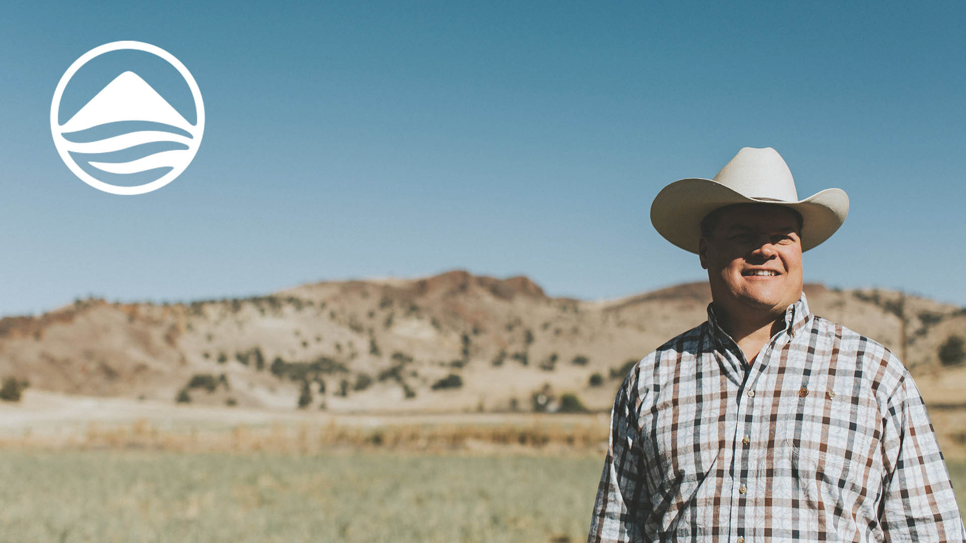
It’s a big, beautiful country out there
Our in-house photo and video team were all about the Columbia Basin, capturing the landscape in its austere awesomeness. Drones. Hiking boots. Time-lapse. We reached into our bag of toys and tricks to get the perfect shot.
Showcasing real people and local businesses, we saw the bank’s mission to support the community come to life. And by visually weaving the land with the people and the bank, we exemplified the scope of the bank’s central promise to customers: “Your Financial Partner for Life.”


Banking on what counts
Through strategy to brand and identity development, we arrived at a simple yet refined result. Clean, minimal, modern, and flexible. A new look for a legacy built on decades of trust. We deployed the brand across all touch points: digital identity, signage, marketing collateral, product pages, and internal documentation.
The new logo—symbolic of the Tri-Cities and the confluence of the Yakima, Snake, and Columbia Rivers—needed a unifying design system that would encompass the diversity of the bank’s demographics. Creating a secondary tagline, “Banking on what counts,” we used the logo to dynamically express the trust, partnership, and reliability that Community First Bank embodies.


YOUR FINANCIAL PARTNER FOR LIFE.
Deliverables
Strategy
Brand & Identity
Marketing Collateral
Video
Photography
Website Design & Build